Reading Words & Images Lecture Notes
The Treachery Of Images Task
Semiotic analysis – 30 minutes exploring:
The text message of the piece “Ceci n’est pas une pipe.”, hand-written (& the artist’s signature), “This is not a pipe.” A literal statement, punctuated with a period which could have easily been omitted. The text alone is a short and simple statement of fact that would suggest that whatever it is accompanied by is not a pipe.
The image itself is a realistic rendering of a pipe (in oil paint). The pipe itself has light & shadow cast upon it [Denotation], suggesting that it exists within a three-dimensional reality, imitating that of our own [Connotation]. However, the pipe is suspended alone in a formless beige space which may bring into question its authenticity as a real object. It is the only image within this work. Combined, the image and the text are, in a literal sense, in direct contradiction with each other. The image is clearly a pipe, yet the text states in no uncertain terms that “This is not a pipe.”. If one looks beyond the literal denotations of each element, one may read that since this piece of work is a painting of a pipe, and not a pipe itself, the text is correct. The text invites this line of questioning from the viewer, as a literal interpretation results in a paradox & one must seek alternate interpretations to resolve the paradoxical reality presented. Convergent anchorage: The text and image lose their meaning without each other, but when combined they pull the audience into the premise behind this particular piece of work.
0 Comments
The film the Da Vinci Code (2006) was the first thing that came to my mind upon reading that the topic of this lecture would be semiotics.
The film has examples of the exploration of semiotics throughout. By viewing, contemporarily mundane symbology in the setting through different lenses, those of a different historical context and cultural interpretations, the protagonist is able to read & understand more of the world presented to them compared to other characters.
Semiotics Lecture Notes
Semiotics – Study & examinations of signs & symbols. Context affects connotations & interpretations. Signs & sign-systems within society.
Semiotics linked with structuralism.
Signs can be assembled together to form codes, connotations that can be inferred when signs are connected. Semiotics can be used as a system to read the world around us & understand the core aspects of meanings. Origins of semiotics lies with linguistic studies, trying to understand language as it stands at any one point in time. Ferdinand Saussure (1857 - 1913), Charles Pierce (1839 - 1914).
Language is the vehicle for which the brain expresses its experiences. Language carries an inherent ideology, as it develops throughout time alongside cultural ideals. The exchange of ideas is facilitated through language. Written language is full of signs, words, signs are arbitrary and irrelevant from the subject they represent. Signs function because they are different from others.
Myth reflects a cultural perception of signs. Barthes influenced by Karl Marx. Communism, demonstrably, the most dangerous ideology present in the modern world. Barthes writes about Parisian wrestling as a vehicle to discuss semiotics. Break Questions
How is the role/ character of each wrestler defined and communicated to the audience?
The commentator introduces them describing their physical power through height and weight statistics, prior knowledge of them is inferred by the experienced audience reaction (booing for the Giant Haystacks, cheering for the Big Daddy) audio queues of celebratory trumpets bolster the introduction of Big Daddy. Body language of the wrestlers themselves as they are introduced conveys their disposition, Giant Haystacks steps out into the ring and merely makes his presence know by raising his arms, whereas Big Daddy saunters around the ring appealing to the crowd with his boisterous movements. What is the role played by the commentator? The commentator describes events of note within the ring, and prescribes a tone to current events with their reaction to events and rhetorical questions building tension around the action. What about the role of the referee? The referee enforces the pre-determined rule-set on the match, providing the framework for which the action may take place within. The referee also provides a visual comparison of a normal man contrasting against the titans in the ring. The referee’s actions can be theatrical in nature, as he contends to negotiate control over the giants in the ring. The presence of the referee represents control of the match & fair play, when he is absent from the action, anything goes. The referee is as much a performer as the wrestlers themselves. Crowd response is the action in the ring clear to follow? If so how is this made possible? The general tone of the action in the ring is clear to follow, some specific incidents may be somewhat obscured from the audience unintentionally. The commentator leads the audience through the action. Exaggerated gestures from the wrestlers and referee add clarity to the action. Based on observation would you classify wrestling as a sport? It’s theatre, a performance. Sport, as I interpret it, is a competition between athletes pushing themselves to their absolute limits to succeed within the parameters of an event, wrestling just does not have the authentic competitive nature of a true sport. Wrestling has all the trappings of a sport, but wrestling is not a sport, it is a performance. Wrestling sells the appearance of passion without the true motivation or consequences of real passion. Roland Barthes' Mythologies Notes
Barthes describes wrestling as an open-air spectacle, this inspires the idea of romantic freedom, and accessibility. A form of entertainment for the common people.
The idea that wrestling is a sport is quickly dismissed in favour of the view that wrestling is a performance, a form of theater. However Barthes does address some wrestling that is done in a sporting context, true wrestling, an actual physical competition with victory being the primary motivator of the wrestlers involved. The audience's awareness of the true authenticity of the fight is declared as irrelevant, as they are only concerned in the shallow perception of the contest within the ring. Spectators view wrestling for the spectacle of action, as long as the show is good the suspension of disbelief remains. Exaggerated gestures and a clear framework, or language, of how the wrestling bout occurs helps the audience members understand the narrative being performed. Wrestlers are presented as avatars of morality, and such alignments are made obvious from the moment a wrestler enters the ring, their actions, their gestures, even their attire paint a character that each wrestler plays upon the stage. Barthes discusses the concept of the Salaud, the "bastard", or in modern wrestling terminology, the Heel. The salaud plays into their role to make the crowd despise them, creating a passionate investment in the wrestling bout. The salaud's character is built of established cultural stereotypes, the cultural language is exploited, so that the audience recognises that they should despise the salaud. Gestures are exaggerated and embraced by the wrestlers, a clear display of unbridled passion in each action creates a compelling performance to invest the audience. Wrestling is used as a vehicle for audiences to vicariously play out a battle between good and evil, to grapple with the struggle of morality through the performance afforded to them by the wrestlers. The BriefTo provide an appropriate conceptual illustration to fit a given article. The article for my project is Videogames have replaced music as the most important aspect of youth culture an opinion piece published by the Guardian. The parameters of my illustration are: One illustration measuring 125mm high by 85mm wide, in a CYMK colour format One animated illustration to be featured online (which is to be an animated version of the initial illustration), in an RGB colour format. Out of all the articles on offer, I believe this is the one I have the most innate understanding on. My childhood was at a key point in this transition. I remember listening to cassette tapes & CDs on barely portable bulky players & clunky two-in-one cassette/ CD boom-boxes, then transitioning into video games as my primary source of entertainment. Research & InspirationVideo Game Symbols & Visual Language
Music Symbols & Visual Language
Initial Thumbnail IdeasAs my article is about music being replaced by video games as the prime spot in cultural influence, my initial ideas try to combine aspects of the two, showing video games in the spotlight, or music fading away.  Video games have a certain visual code associated with them. Very early on I decided to capitalise on a historical video game aesthetic: pixel-art. I concluded that appealing to the more retro aspects of video game culture would resonate with the demographic of the guardian more than modern video games, there's more historical ground to base my illustration on this way. Stereotypes become more defined over time, so a wider demographic will recognise certain visual language reliably if there's a precedent behind it. Developed ThumbnailsThe thumbnails I decided to explore further were the ones with the most retro video game appeal.  Classic, long lived, video game character Link (The Legend of Zelda 1986 - Current), smashing a guitar represents video games destroying music culturally through direct metaphorical representations of each industry. 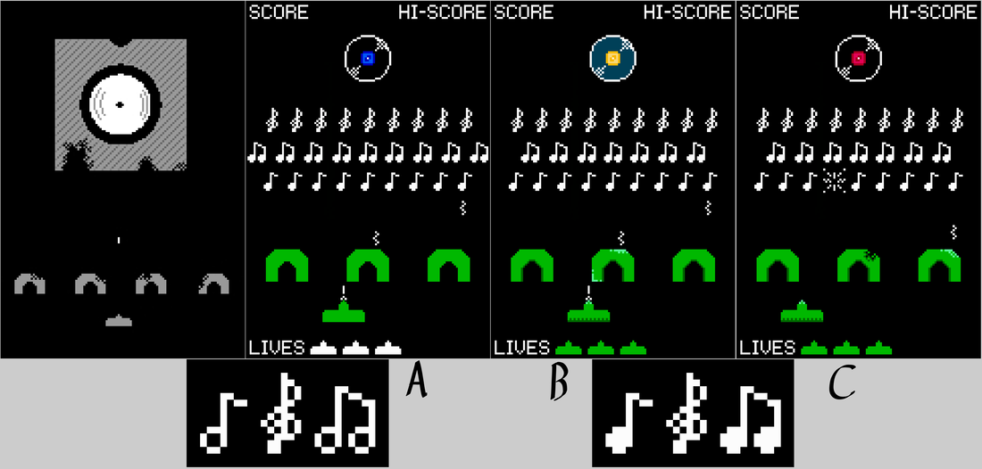 Retro arcade game Space Invaders (1978) re-skinned to replace the traditional enemies into musical icons. The trappings of video game U.I. (user interface) elements provide a recognisable visual alongside the alternative content of musical icons. The frame becomes quite busy without communicating much. The simple assets lend themselves to animation. 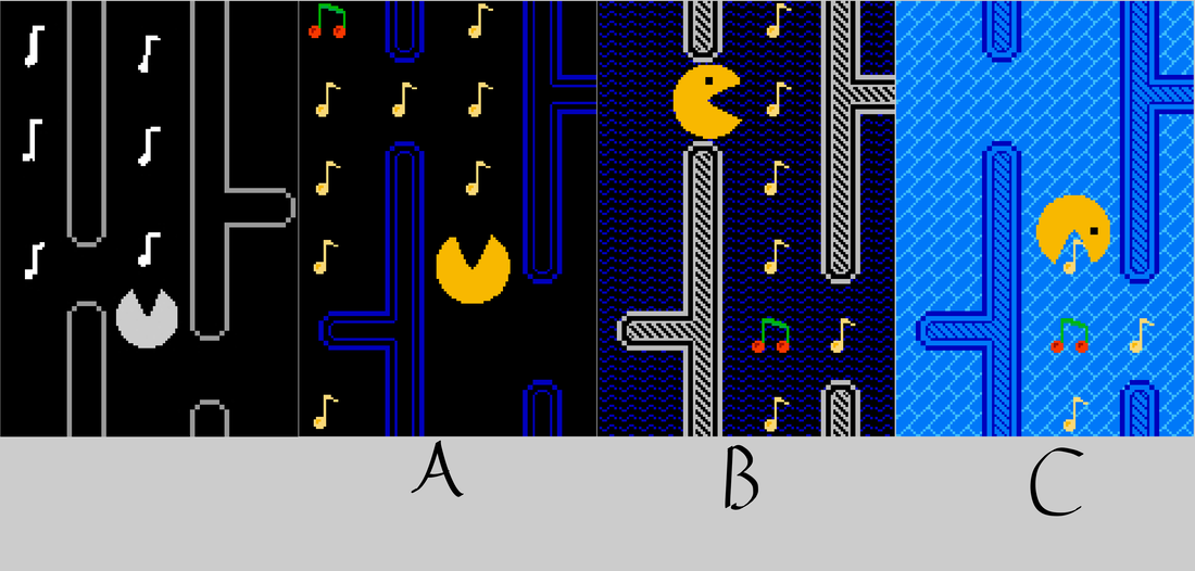 Another retro arcade game, Pac-Man (1980) reskinned to replace the typical pellets with musical notes, I'm very happy with the cherry reskin. The frame limits what's possible with this idea I believe, but the simple assets would make animation easy. Finalised Idea Development & ProductionLink smashing a guitar. Visually the most interesting, and technically the most challenging to animate.
Outcomes
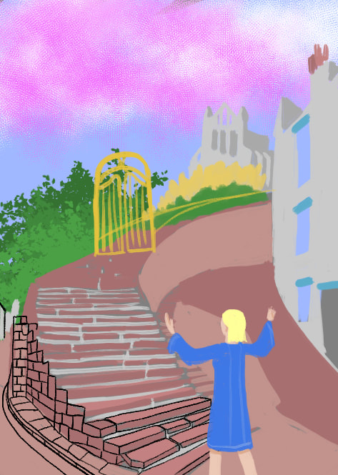
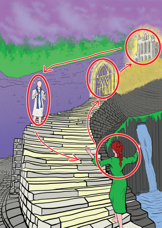
 Contextual Web Article Mock-Up This project will explore the use of colour within an image to create a mood, and to convey a message independent of the explicit content of an image. To do this, we are given a text and some art direction notes which will determine the mood & atmosphere the final illustration should contain. The text & art direction I am to work from is as follows: Thomas Traherne Centuries of Meditations The corn was orient and immortal wheat, which never should be reaped, nor was ever sown. I thought it had stood from everlasting to everlasting. The dust and stones of the street were as precious as gold: the gates were at first the end of the world. The green trees when I saw them first through one of the gates transported and ravished me, their sweetness and unusual beauty made my heart to leap, and almost mad with ecstasy, they were such strange and wonderful things: The Men! O what venerable and reverend creatures did the aged seem! Immortal Cherubims! And young men glittering and sparkling Angels, and maids strange seraphic pieces of life and beauty! Boys and girls tumbling in the street, and playing, were moving jewels. I knew not that they were born or should die; But all things abided eternally as they were in their proper places. Eternity was manifest in the Light of the Day, and something infinite behind everything appeared which talked with my expectation and moved my desire. The city seemed to stand in Eden, or to be built in Heaven. The streets were mine, the temple was mine, the people were mine, their clothes and gold and silver were mine, as much as their sparkling eyes, fair skins and ruddy faces. The skies were mine, and so were the sun and moon and stars, and all the World was mine; and I the only spectator and enjoyer of it. I knew no churlish proprieties, nor bounds, nor divisions: but all proprieties and divisions were mine: all treasures and the possessors of them. So that with much ado I was corrupted, and made to learn the dirty devices of this world. Which now I unlearn, and become, as it were, a little child again that I may enter into the Kingdom of God. Art Direction: rapturous, warm, magical, visionary unreal, comforting, celebratory, spiritual Research & InspirationI've aimed to collate several images which convey elements which I believe fit within the art direction notes I am tasked to work from.  Concept Art Of The Planet Sorgan For The Mandalorian God-rays spilling through the trees create a sense of warmth & comfort, and a somewhat unreal element within this image. The connection with nature has a spiritual atmosphere about it as well.
 Exodus - Mark Bryan The content of this piece clearly fulfils the unreal element, but the pose of the figure upon the rock is celebratory, and somewhat spiritual given the miraculous events unfolding, arms open to the world before it.
 The Princess Bride - Gustavo Viselner The contrast between the cold colours upon the rocks, and the warm light in the sky cast across the scene creates a grand feeling of scale outside of what's visible to the viewer. The motif of a sky without a visible horizon adds to the scale and with that scale creates a sense of unreal wonder. Thumbnails
Developed Illustration
The whole figure can be used to communicate, through gestures and body language, in this exercise, body language will be the primary method for conveying a message.  Body Language Silhouettes To explore body language and communication through gestures, six scenes are the subject of a thumbnailing exercise.
Angry Boss Thumbnails
Good News Thumbnails
Mum Can We Go Now? Thumbnails
The Anniversary Thumbnails
The Big Jump Thumbnails
Genius At Work Thumbnails
The lockdown diary should fit these criteria:
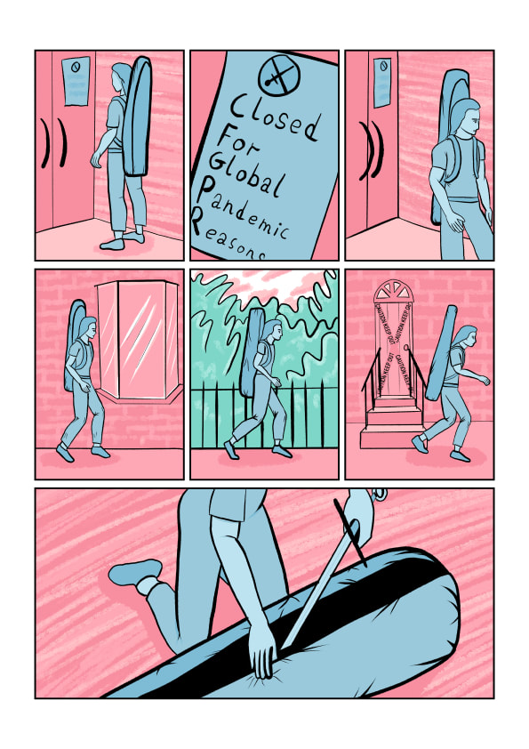
The story I will be telling in my comic is the cancellation of sword fighting activities due to lockdown, transitioning into doing sword drills in a cramped indoor space, and then the resulting destruction and renovation of the indoor space.
Thumbnails
These are the rough compositional thumbnails in roughly the format I want to produce this book in.

As I'm going to make this comic digitally, I looked at some tutorials on techniques that other artists use to produce their comics.
A complete view of a comic development process from conception to finished product has given me a good idea on how to proceed with my own work-flow.
The use and adaptation of three dimensional assets can be used to speed up aspects of drawing, and keeping subjects consistently proportioned, but for the moment this technique feels more advanced than I am capable of within this project.
Page Sketches
These are the sketches made digitally in the exact format I will produce the comic in. I will ink all the sketches, adding details and refining the composition, and then colour the resulting linework.

Back (Left) & Front (Right) Cover Sketches
Illustrated Pages
Composition PrinciplesThe way an image is constructed within a frame changes how it is perceived. Humans have many in-built pre-conceptions about shapes, lines, colours, and their interactions relative to each other, for example straight parallel lines orientated in increments of 90° reinforce the idea of structure and stability, whereas lines that are almost 90° begin to create a sense of instability and tension. The way pieces of art are composed within a frame can reliably exploit these pre-conceptions to change the mood of the work.
Thumbnail Compositions Thumbnails With Dynamic Composition, Washing Clothes, & Skiing To explore composition, and thumbnail visuals, we were given six scenarios to create a series of thumbnails for, and then create a more developed thumbnail visual for the intended outcome piece.
Ambushed Thumbnails
Vertigo Thumbnails
Tango Thumbnails
Systems Failure Thumbnails
A Giant Leap
January Sales Thumbnails
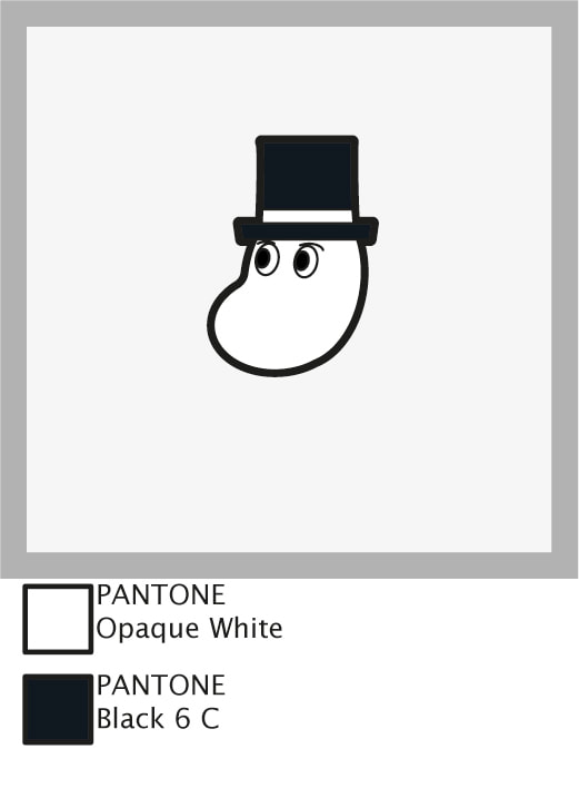
Within this project we're set to create three enamel badges, based on an already existing pop-culture property, with associated packaging & branding ephemera. These designs are to be limited to a maximum of four pantone colours & line, and to be an appropriate size for enamel pins (I've researched they should be 15-40mm²). Enamel Pin ExamplesThe conventional packaging for enamel pins is a piece of sturdy backing card to which the pin is attached, and often incorporated into the design so that the pin and the card compliment each other in their aesthetics. The degree to which the pin design and the backing card's design match can vary.
Subject Research - Moomins The modern 3D animated Moomn TV series, Moominvalley (2019), continues the soft & squishy look of its predecessors but with a new animation style. The 3D rendering uses lighting and gradients to describe the soft nature of the world its set in. While this style isn't something I'll be able to achieve with flat-colour enamel pin designs, the vibe is certainly something to aim towards.
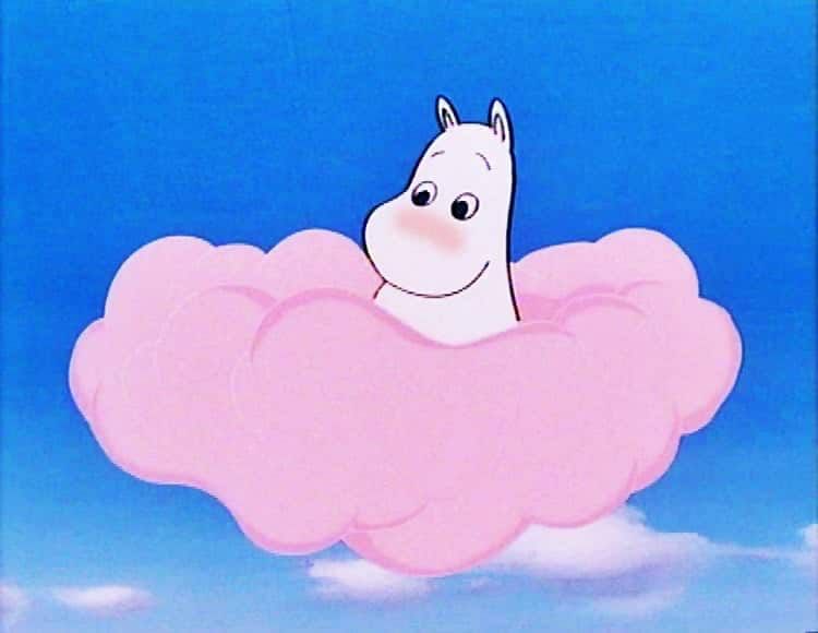
The animated Moomin TV series in the 90s, Moomin (1990), has a very soft aesthetic to it, using pastel colours in a fantastical setting, the greater use of flat areas of colour allows a more direct translation from this iteration to enamel pins. I can see how certain solutions have already presented themselves in the way they are drawn & animated for some problems I might have in my designs.
The absurd contrast between the soft and gentle design of moomins and the presence of knives in the setting is very amusing. Very chaotic vibes.  The pastel colour pallet of pinks and purples adds to the mystical nature of the setting. It's definitely a combination I want to explore with my packaging treatment. Putting weapons in the hands of soft and round children's characters is a tradition that Moominvalley (2019) upholds.  The monochromatic design of the packaging is reminiscent of the original books & comic series of Moomins. Enamel Pin DesignsThe design restrictions are:
 Design Size Specifications Visualised
 Quick Pin Mock Up Using Design Assets From Illustrator Imported To Photoshop  Backing Card Design I've tried to keep within the aesthetic of pink/ purple pastel colours for my backing card design. Leaving a central area to display the pin, and having a fairly balanced composition that draws the eye to the center of the frame. Now that I've got a template piece to work from, I have the option to alter the gradients slightly from piece-to-piece to hint at a handmade aspect to these backing cards.   
Having these mock ups scaled to their designed size of A6 helps judge the areas in which they succeed or fail much easier. It's very easy to get hung-up on tiny little details when working on a digital image that can scale dynamically, but taking a step back to look at the work as it's intended to be seen is important.
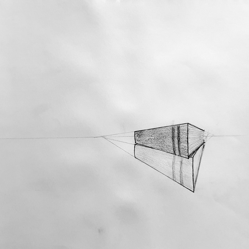
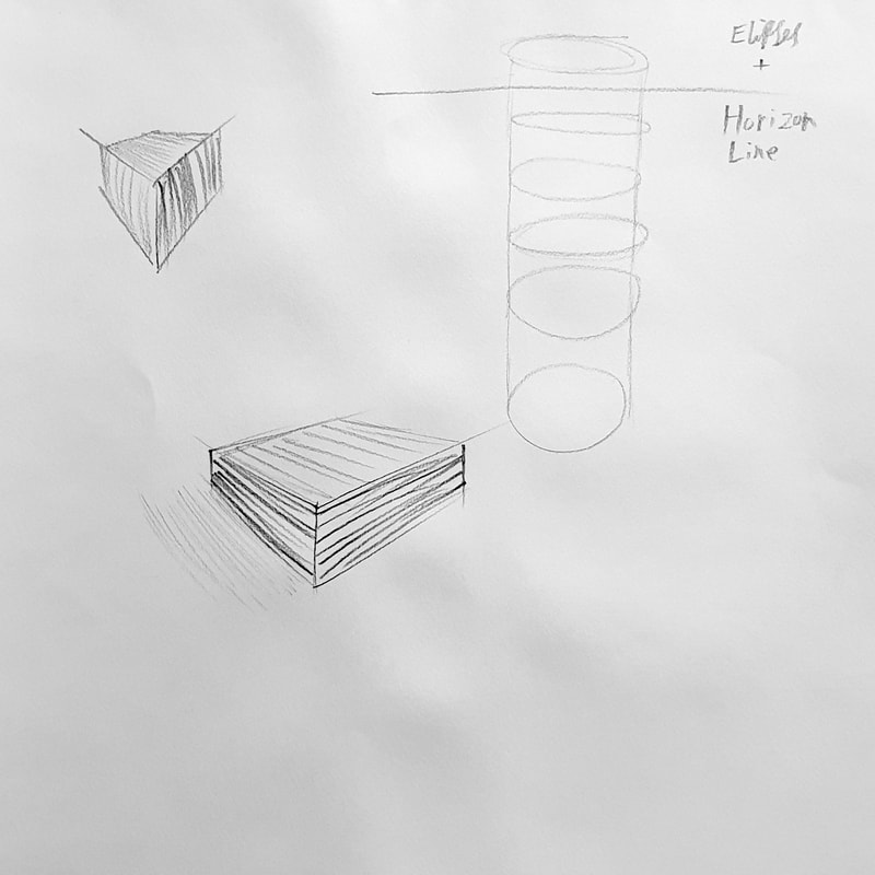
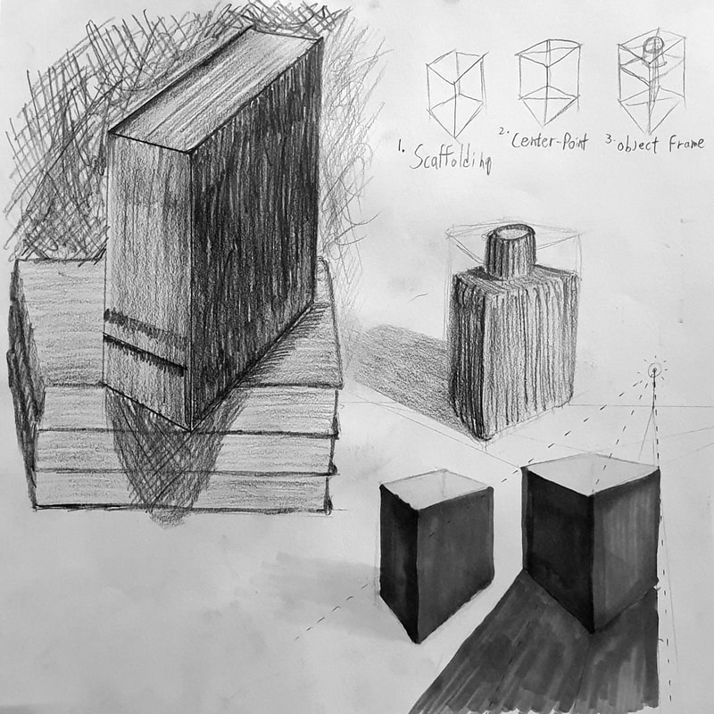
PerspectiveThese sketches explore the understanding of perspective, using a diagrammatic approach to break down the technique. Light sources and cast shadow are considered in some of these drawings as well as the impact of directional mark making to describe form.  In this exercise I looked at tonality in the form of an ink wash. Directional marks are more subtle in ink washes, but they still add to the sense of form and structure within the piece.
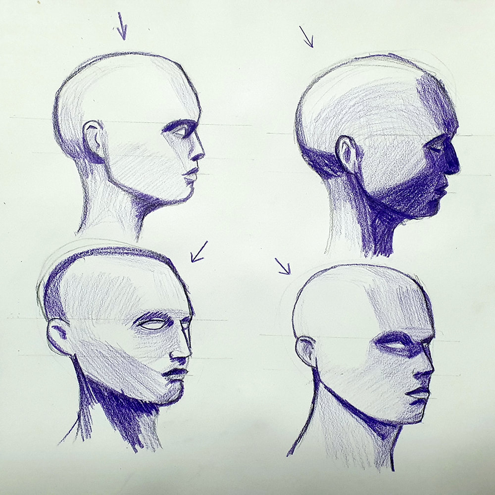
FigureHeadsGetting the head and its proportions right can make or break an illustration.    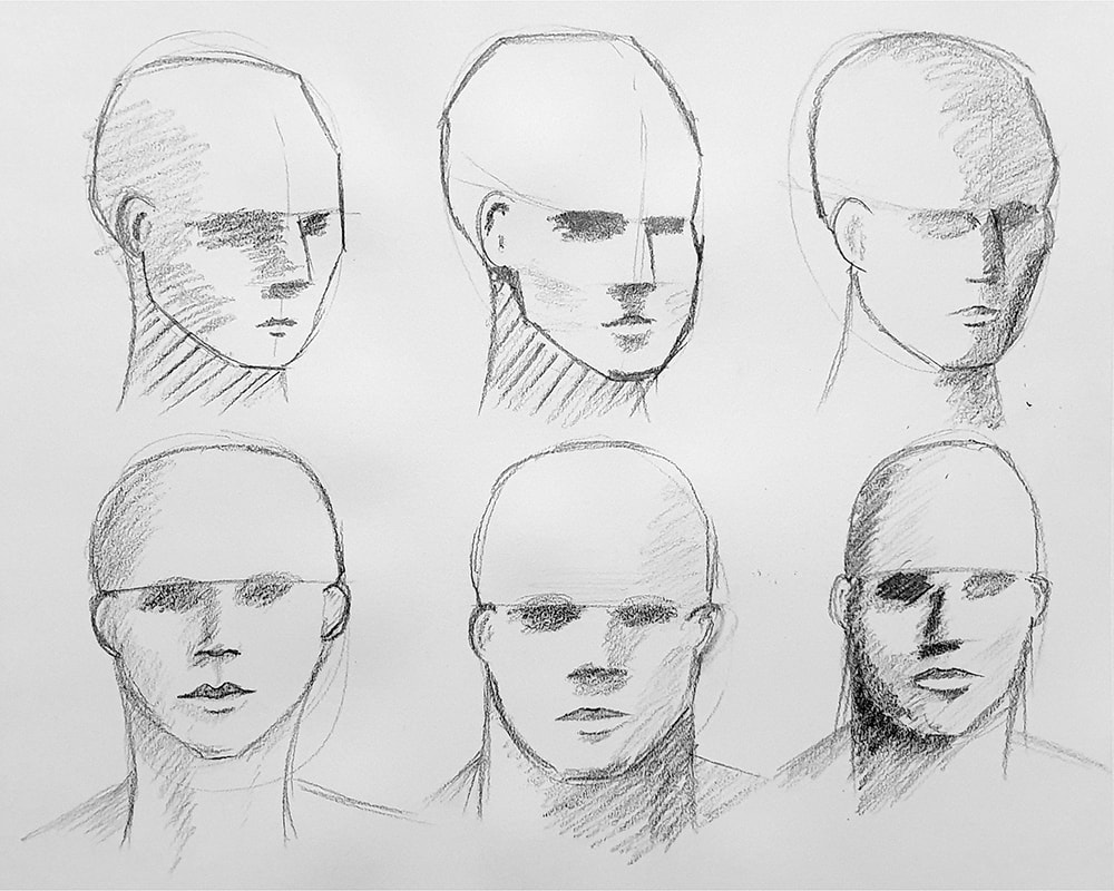 There's a slow progression through these six heads in using a wider range of tones, As I go through them I become more aware that I'm using mostly mid-tone greys and I try to use darker tones. In the examples where I have used darker tone I feel there's more weight to the illustrations.
I feel like using coloured pencils encourage me to explore a greater range of tones, instead of hovering around the mid-tone greys as I'm like-to-do with standard graphite pencils. Using the full range of tonal variations is something I've tried to be consistently aware of throughout this process. Blending areas of tone would make this head feel less geometric, the hard edges on the areas of tone make it look like it's chiselled from stone rather than made of flesh. The geometric look does however help define where the areas of tone sit on the face, it just needs smoothing out in the final rendering process.  Research & InspirationAs the final outcome for this project is meant to look analogue, but produced digitally, I've searched for digital imagery with the same intent, to look analogue.
Paper textures seem to be a very effective, and relatively easy, way to add a sense of realism to a digital image. Fuzzier edges to linework and slight misalignments add a hand-made look to things.  The use of the paper as negative space helps enhance the effect of its texture on the work.
 The overlapping interaction of the two colours in this image suggest that it has been printed with slightly transparent ink/ paint in a screen-printing process, the use of only two colours reinforces the idea that this image is a screen-print. Development PiecesThumbnail images in analogue to explore compositions & colour combinations for the final outcome.
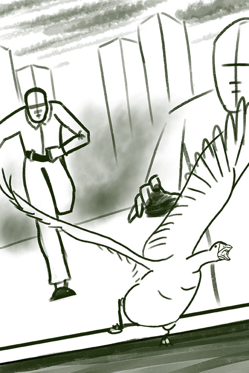
Knight Club Fabric PrintMy first exploration piece into photoshop texture work, just to get a sense of the tools available to me before I moved onto more produced work. Just a quick play-piece to dip my toe in the water.  This piece is meant to look like a hand-made screen print onto a fairly unrefined fabric like a rough linen shirt, a single colour all printed at once over a neutral background. Wave PosterThe idea behind this one was to take iconic imagery and appropriate it for the band poster. The crop allowing the wave to break out of the frame adds some dynamism to the piece, while the position of the band's name leads the viewer's eye back around into the middle of the image after it has been lead out by the wave.  The venue name and band name may be too similar in size for their to be a distinct hierarchy of information. The contrast of each set of text's surroundings are almost equal, so the hierarchy does not distinguish itself there either, perhaps if one of the sets contrasted less it may fall back from the viewer's eye. Funky Fever PosterThis piece was an exploration in an alternative form for the poster, becoming much taller than the standard A-series of paper sizes.  Locker PosterThis is a more developed version of one of the initial thumbnail sketches, an enticing and curious composition of a barely open door, who could resist? The large areas of space in this piece provide plenty of real-estate for text. 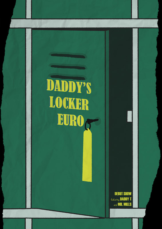 Despite having so much space for text, I found that filling those areas with text detracted from them, becoming too messy. Limited information enhances the curiosity side of this piece. Final Outcome - Coin On A String PosterDeveloped from a thumbnail sketch, I felt like the initial concept was strong, but was missing something. I believe I've solved that with a bold and stand-out composition, a very minimalist design with a strong use of colour that's eye-catching and distinct from a distance.  5% Scale Poster. The concept of a coin tied to a string to overcome some petty cost could very easily be the source of an anecdote that inspired such a band name. The legendary tale of Daddy's Locker Euro where man defeats his mechanical overlord's unjust toll with nothing more than a piece of string and Daddy's Locker Euro. 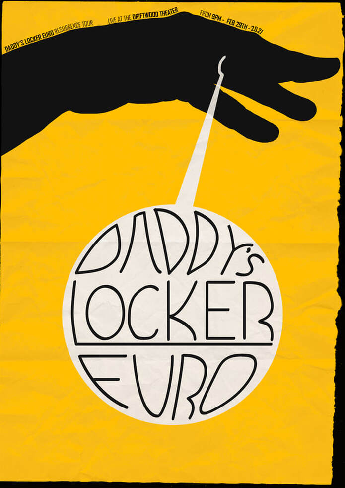 A great concern for myself while making this was whether or not the silhouette of the hand would read as a hand, or merely some shadow puppet monster. I hope that the irregular but distinct form used sells it as such, as it's all monotone there's very little information given to the viewer, and so what little is given must be precise for the piece to succeed.  An Out-In-The-World Mock Up For This Poster. I Learned A Lot About Transform Tools Making This.  Badge Mock Up. I Used A Template For This One. The badge design is a cleaned up version of the initial design's thumbnail sketch. A thematic call-back, very good for branding opportunities.
|
Author:Elliot Watson, Illustrator with a background in historical swordsmanship and all the weird and wonderful trappings that entails. Archives
November 2021
Categories |

























 RSS Feed