|
Within this project we're set to create three enamel badges, based on an already existing pop-culture property, with associated packaging & branding ephemera. These designs are to be limited to a maximum of four pantone colours & line, and to be an appropriate size for enamel pins (I've researched they should be 15-40mm²). Enamel Pin ExamplesThe conventional packaging for enamel pins is a piece of sturdy backing card to which the pin is attached, and often incorporated into the design so that the pin and the card compliment each other in their aesthetics. The degree to which the pin design and the backing card's design match can vary.
Subject Research - Moomins The modern 3D animated Moomn TV series, Moominvalley (2019), continues the soft & squishy look of its predecessors but with a new animation style. The 3D rendering uses lighting and gradients to describe the soft nature of the world its set in. While this style isn't something I'll be able to achieve with flat-colour enamel pin designs, the vibe is certainly something to aim towards.
The animated Moomin TV series in the 90s, Moomin (1990), has a very soft aesthetic to it, using pastel colours in a fantastical setting, the greater use of flat areas of colour allows a more direct translation from this iteration to enamel pins. I can see how certain solutions have already presented themselves in the way they are drawn & animated for some problems I might have in my designs.
The absurd contrast between the soft and gentle design of moomins and the presence of knives in the setting is very amusing. Very chaotic vibes.  The pastel colour pallet of pinks and purples adds to the mystical nature of the setting. It's definitely a combination I want to explore with my packaging treatment. Putting weapons in the hands of soft and round children's characters is a tradition that Moominvalley (2019) upholds.  The monochromatic design of the packaging is reminiscent of the original books & comic series of Moomins. Enamel Pin DesignsThe design restrictions are:
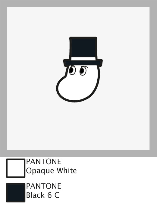
 Design Size Specifications Visualised
Quick Pin Mock Up Using Design Assets From Illustrator Imported To Photoshop  Backing Card Design I've tried to keep within the aesthetic of pink/ purple pastel colours for my backing card design. Leaving a central area to display the pin, and having a fairly balanced composition that draws the eye to the center of the frame. Now that I've got a template piece to work from, I have the option to alter the gradients slightly from piece-to-piece to hint at a handmade aspect to these backing cards.   
Having these mock ups scaled to their designed size of A6 helps judge the areas in which they succeed or fail much easier. It's very easy to get hung-up on tiny little details when working on a digital image that can scale dynamically, but taking a step back to look at the work as it's intended to be seen is important.
0 Comments
Leave a Reply. |
Author:Elliot Watson, Illustrator with a background in historical swordsmanship and all the weird and wonderful trappings that entails. Archives
November 2021
Categories |


 RSS Feed