Research & InspirationAs the final outcome for this project is meant to look analogue, but produced digitally, I've searched for digital imagery with the same intent, to look analogue.
Paper textures seem to be a very effective, and relatively easy, way to add a sense of realism to a digital image. Fuzzier edges to linework and slight misalignments add a hand-made look to things.  The use of the paper as negative space helps enhance the effect of its texture on the work.
 The overlapping interaction of the two colours in this image suggest that it has been printed with slightly transparent ink/ paint in a screen-printing process, the use of only two colours reinforces the idea that this image is a screen-print. Development PiecesThumbnail images in analogue to explore compositions & colour combinations for the final outcome.
Knight Club Fabric PrintMy first exploration piece into photoshop texture work, just to get a sense of the tools available to me before I moved onto more produced work. Just a quick play-piece to dip my toe in the water.  This piece is meant to look like a hand-made screen print onto a fairly unrefined fabric like a rough linen shirt, a single colour all printed at once over a neutral background. Wave PosterThe idea behind this one was to take iconic imagery and appropriate it for the band poster. The crop allowing the wave to break out of the frame adds some dynamism to the piece, while the position of the band's name leads the viewer's eye back around into the middle of the image after it has been lead out by the wave.  The venue name and band name may be too similar in size for their to be a distinct hierarchy of information. The contrast of each set of text's surroundings are almost equal, so the hierarchy does not distinguish itself there either, perhaps if one of the sets contrasted less it may fall back from the viewer's eye. Funky Fever PosterThis piece was an exploration in an alternative form for the poster, becoming much taller than the standard A-series of paper sizes.  Locker PosterThis is a more developed version of one of the initial thumbnail sketches, an enticing and curious composition of a barely open door, who could resist? The large areas of space in this piece provide plenty of real-estate for text. 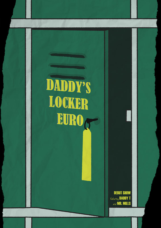 Despite having so much space for text, I found that filling those areas with text detracted from them, becoming too messy. Limited information enhances the curiosity side of this piece. Final Outcome - Coin On A String PosterDeveloped from a thumbnail sketch, I felt like the initial concept was strong, but was missing something. I believe I've solved that with a bold and stand-out composition, a very minimalist design with a strong use of colour that's eye-catching and distinct from a distance.  5% Scale Poster. The concept of a coin tied to a string to overcome some petty cost could very easily be the source of an anecdote that inspired such a band name. The legendary tale of Daddy's Locker Euro where man defeats his mechanical overlord's unjust toll with nothing more than a piece of string and Daddy's Locker Euro. 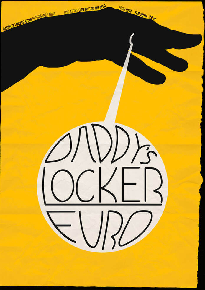 A great concern for myself while making this was whether or not the silhouette of the hand would read as a hand, or merely some shadow puppet monster. I hope that the irregular but distinct form used sells it as such, as it's all monotone there's very little information given to the viewer, and so what little is given must be precise for the piece to succeed.  An Out-In-The-World Mock Up For This Poster. I Learned A Lot About Transform Tools Making This. Badge Mock Up. I Used A Template For This One. The badge design is a cleaned up version of the initial design's thumbnail sketch. A thematic call-back, very good for branding opportunities.
0 Comments
Leave a Reply. |
Author:Elliot Watson, Illustrator with a background in historical swordsmanship and all the weird and wonderful trappings that entails. Archives
November 2021
Categories |


 RSS Feed