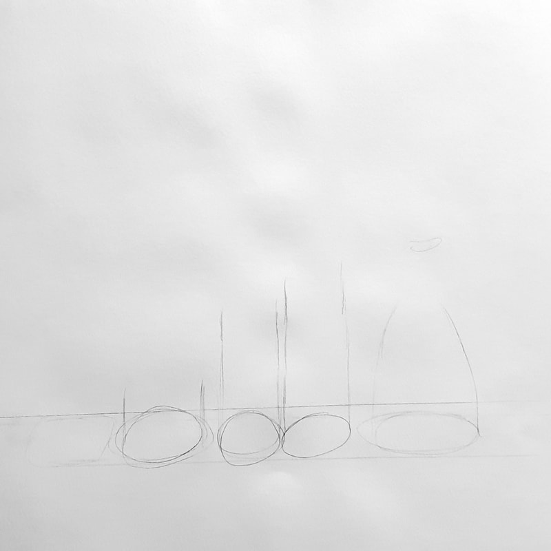
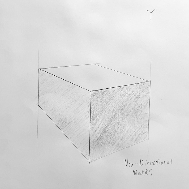
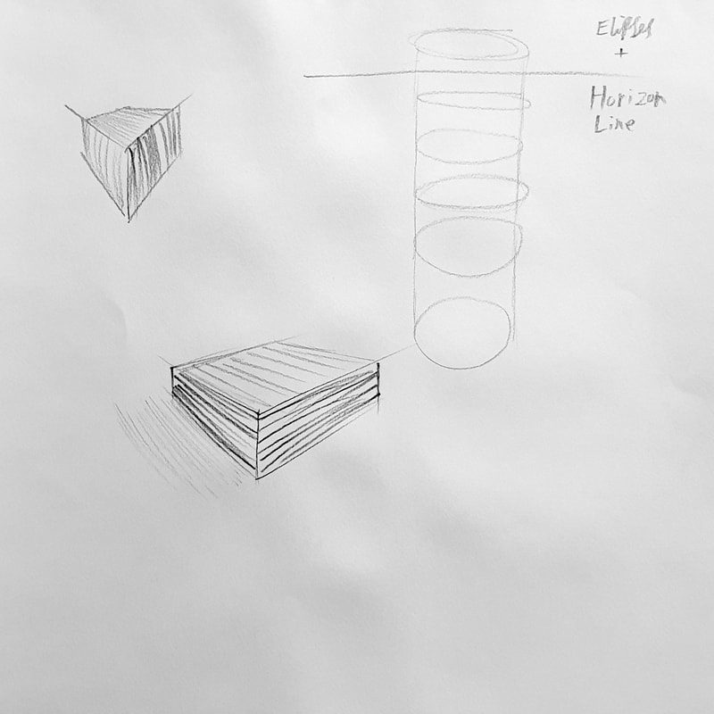
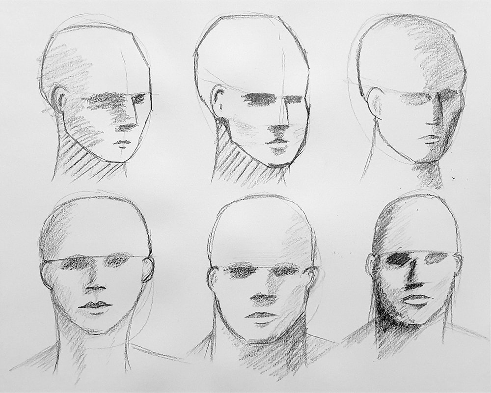
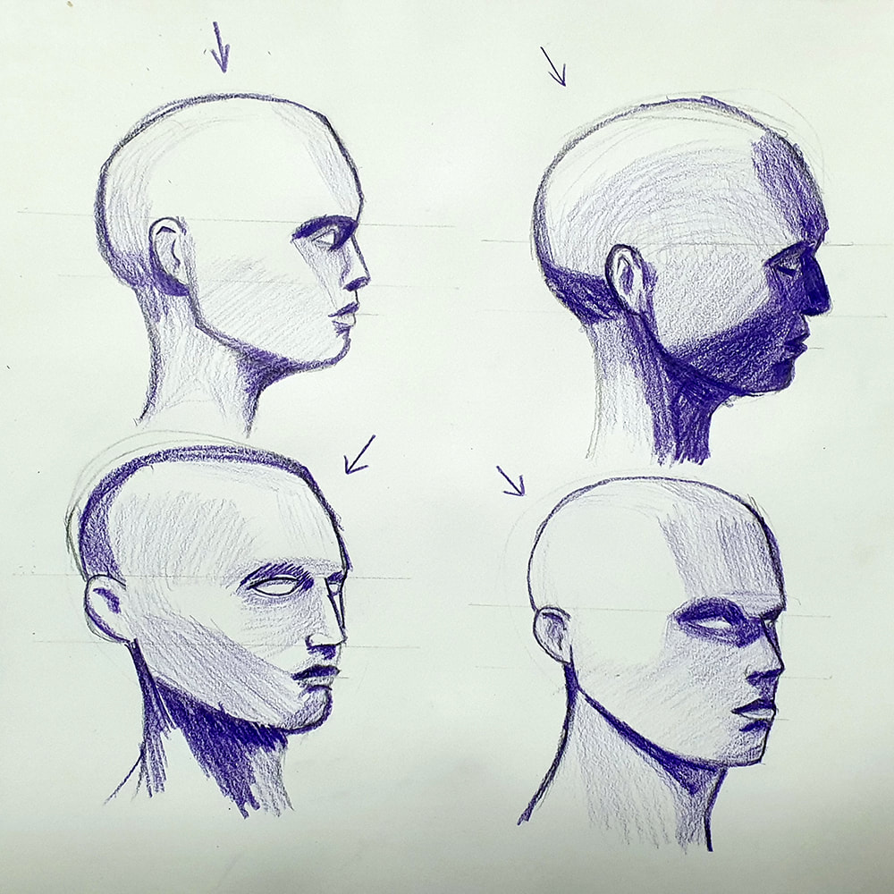
PerspectiveThese sketches explore the understanding of perspective, using a diagrammatic approach to break down the technique. Light sources and cast shadow are considered in some of these drawings as well as the impact of directional mark making to describe form. In this exercise I looked at tonality in the form of an ink wash. Directional marks are more subtle in ink washes, but they still add to the sense of form and structure within the piece. FigureHeadsGetting the head and its proportions right can make or break an illustration. There's a slow progression through these six heads in using a wider range of tones, As I go through them I become more aware that I'm using mostly mid-tone greys and I try to use darker tones. In the examples where I have used darker tone I feel there's more weight to the illustrations. I feel like using coloured pencils encourage me to explore a greater range of tones, instead of hovering around the mid-tone greys as I'm like-to-do with standard graphite pencils. Using the full range of tonal variations is something I've tried to be consistently aware of throughout this process. Blending areas of tone would make this head feel less geometric, the hard edges on the areas of tone make it look like it's chiselled from stone rather than made of flesh. The geometric look does however help define where the areas of tone sit on the face, it just needs smoothing out in the final rendering process.
0 Comments
Leave a Reply. |
Author:Elliot Watson, Illustrator with a background in historical swordsmanship and all the weird and wonderful trappings that entails. Archives
November 2021
Categories |
Site powered by Weebly. Managed by 34SP.com






 RSS Feed