Acrylic/ Oil PaintingEwan McClure


The context provided by the scene in this piece makes the objects present in it more believable despite the clear brush marks and rough strokes on the objects themselves.
George Clausen
The negative space of the canvas blends into the sky with faded brush strokes to ease the transition.
The choice of contrasting colours give these paintings a believable sense of life to them, while the sketchy nature of their extremities betray the nature of the work. Details are present where they are needed to provide context.

Fairly abstract brush strokes manage to capture a sense of this tree, the effect is greater from a distance, as the individual brush marks become less defined and the image as a whole takes form.

Acrylics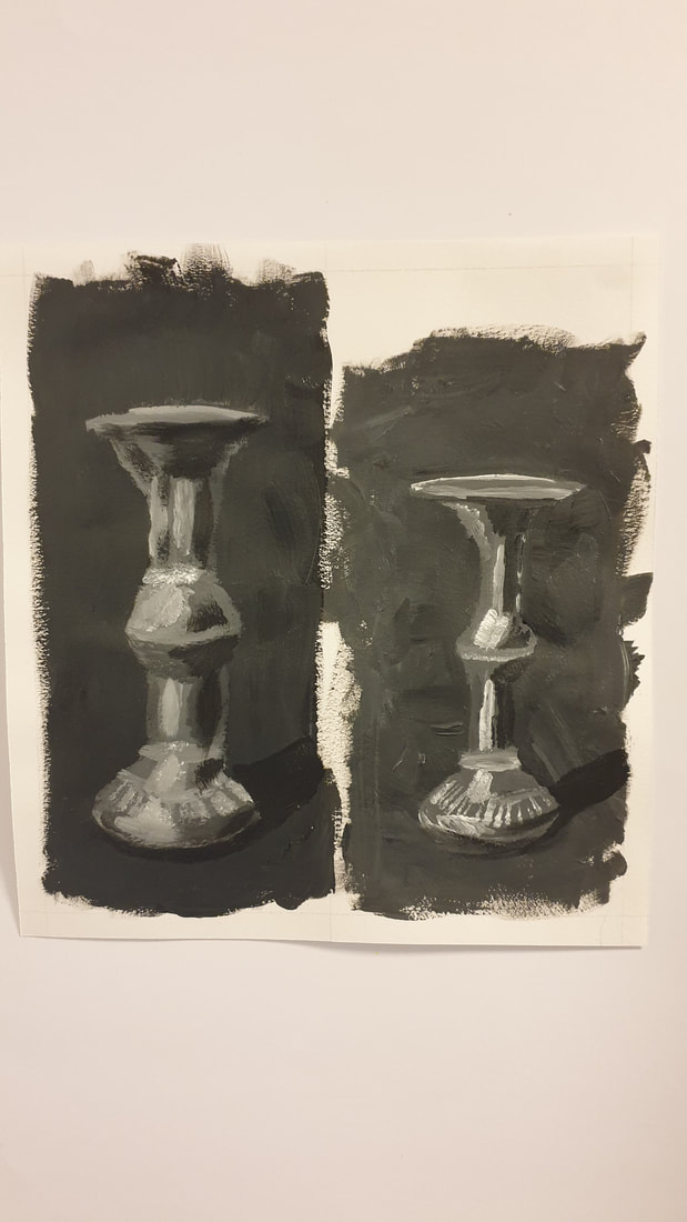
Candlestick Studies

Still Life Of Apples & A Book
I tried to emulate the rough brush marks as a way to describe forms which I feel has worked well enough on the pages of the book, but there isn't enough contrast on the apples for the effect to work as well.
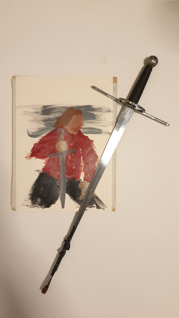
Distance Painting Process - Dagger Painting
I've been advised previously to stand back and look at a painting from a distance to judge and understand the piece better. So, with this in mind I decided to paint an entire image at arms length. I'm quite happy with how the jawline has managed to define itself among the chaos.
This painting seems to work better at greater distances, which should only be natural given how it was produced, perhaps a larger scale could be a point of improvement in a similar painting in the future.
Acrylic Process - Korra
This was definitely a hard-learned lesson on planning out which parts of a painting to do first. If I was smart about it, I would've started with the parts in which are overlapped by other layers first as to avoid having to touch up areas as much, or even at all in some cases.
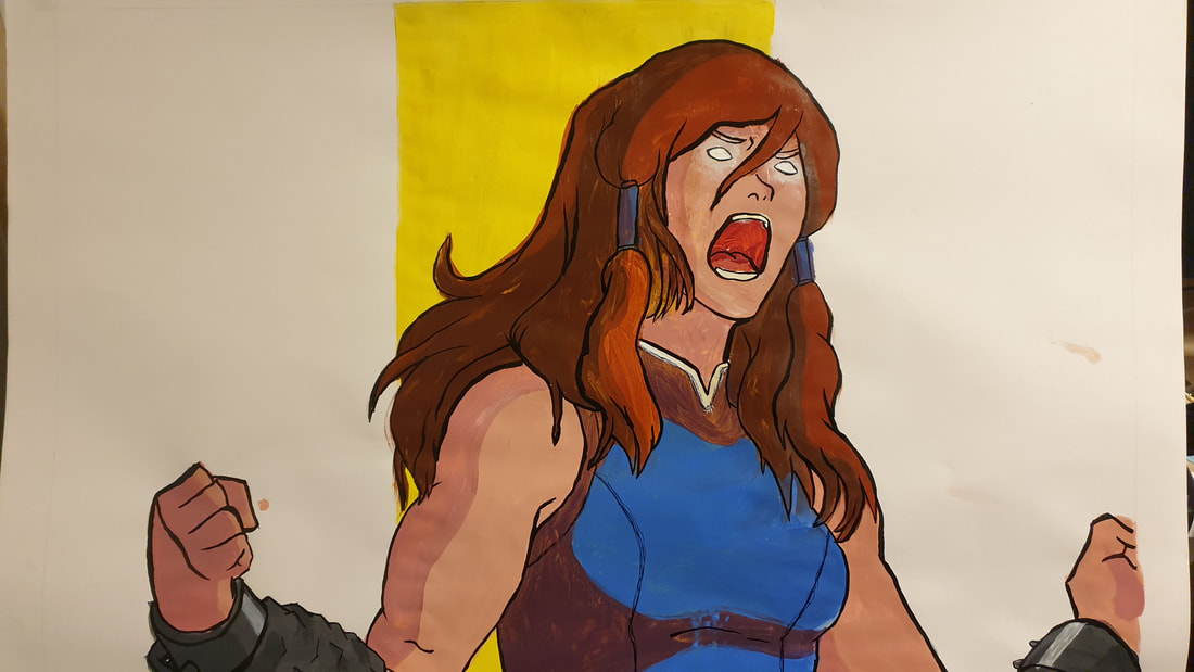
Working with a partial ground covering the canvas showed the clear and distinct effect that it had on the layers painted atop it.
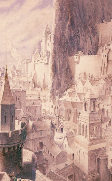
Watercolour PaintingAlan Lee
The bright white of the paper really shines through in the river
The use of aerial perspective in these two adds to the scale of their settings.

Watercolours seem to be the medium of choice for depicting scenes of nature, or grand vistas. A very appropriate medium for Lord Of The Rings artwork.
Brian Sanders

The break-out elements in these paintings are really playful additions that, I feel, help elevate these pieces of work.


The fog effect on the trees in the background with the early morning light just beginning to cut through the boughs adds a magnificent sense of atmosphere to this painting.
Watercolours
Thumbnail Paintings Of Trees Under Fog
This was a fun experiment, building up layers of cool colour washes to emulate fog density.

Monochromatic Aerial Perspective Attemp
With lighter washes of the same colour fading towards the back of the scene I created, albeit a rather sudden and dramatic, aerial perspective elements to suggest a sense of distance.

I desperately need to develop the patience required to work with watercolours, or get something to dry them quicker...
Layer Process - Desert Stones
Working on three separate scenes along side each other allowed me to work on one whilst the other two dried. This also allowed me to try some variations with a very direct visual comparison.

I'll have to look into alternative methods of masking and fastening my watercolour pieces, as so far gum strip and my current masking tape have caused quite a few issues with tearing. Also my set of watercolours definitely need an upgrade, as my current set have a chalky quality to them. I've been told that water colour paints are one of the few art supplies that suffer greatly at lower price points.
0 Comments
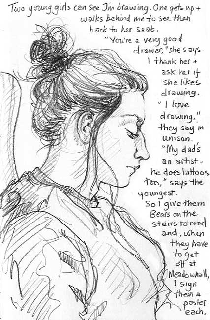
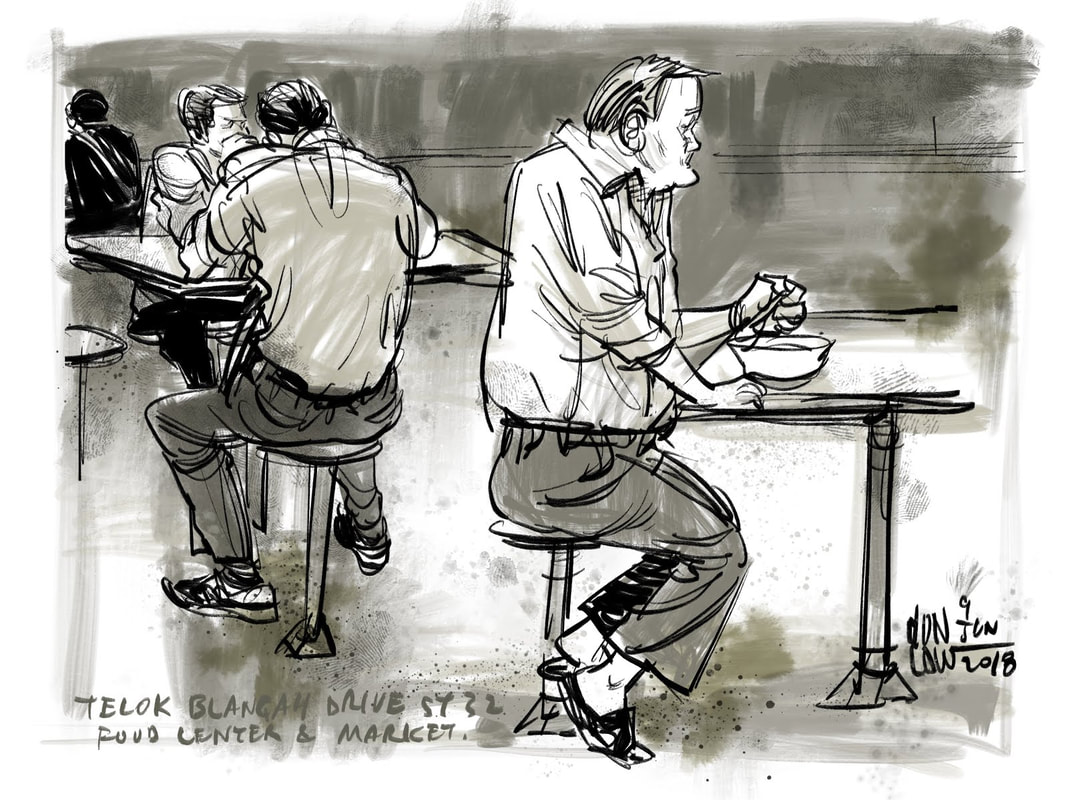
Research & InspirationLynne Chapman - Personal Sketchbook WorksLynne Chapman is a contemporary British artist who focuses on in-the-moment illustrations of life, aiming to capture an essence of events within her drawings. I find the sketchy look of these illustrations very appealing, key lines and forms are defined but there's an almost fuzzy effect that comes from lots of rough lines which seems to ground these works in reality a little bit more.  I like that the time constraints of doing life drawings in the world force artists to make looser, but more considered lines to achieve detail. There's an economy of speed and detail constantly at odds with each other, and the end results are often better off for it.  Don Low - Singapore Sketches (2018)Don Low is a contemporary Singaporean artist who sketches locations as a way to gain a greater, and perhaps often overlooked, understanding of them. Everyday sketching is a way to catalogue places and events, like a journal of images rather than words. The limited colour pallets add to the atmosphere of these drawings with warmer or cooler tones being used.  Fading out the composition, only including interesting or important details could be one way of balancing time constraints, working almost radially from the focal point and deliberately omitting bland features of a scene. Wild Life Drawing
Class SketchesAs a quick warm up task we, as a class, sketched each other over the course of an hour. This task was challenging because we were all simultaneously drawing and being drawn at the same time, so there was plenty of movement going on. Life DrawingsHere's a collection of my life drawings, some from real life, some the product of dubious virtual life-drawing, all rough depictions of life in the moment. 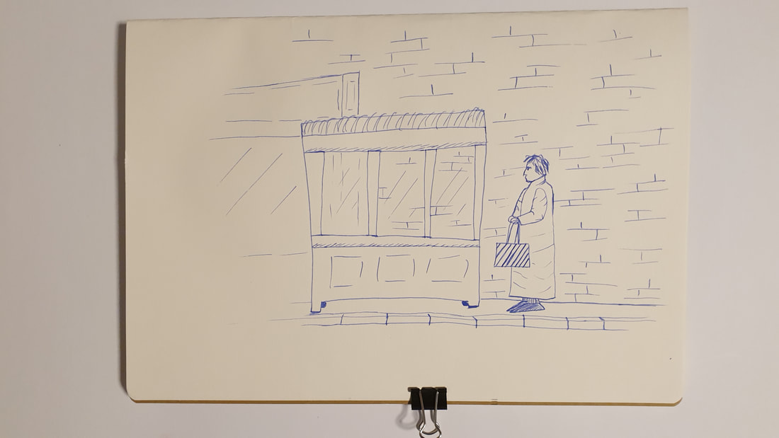  I find drawing in the moment, without reference images or even a pencil sketch as a guide, forces me to capture an essence of something rather than a slavish recreation.  Carlisle Train Station Window  Carlisle Train Station Bench  Edinburgh Zoo has a live-feed camera in their Koala enclosure, so I was able to do a virtual life drawing of a Koala, they're ideal subjects for life drawing because they do not move very much.
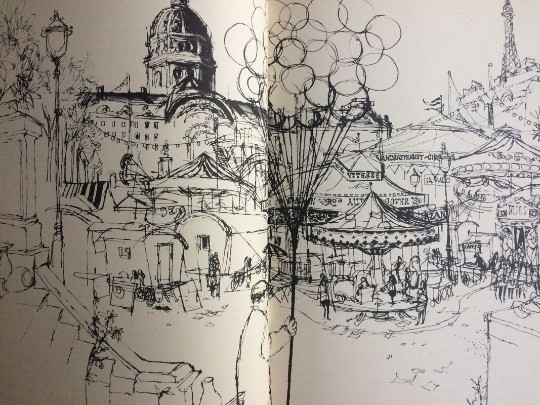
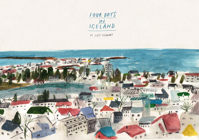
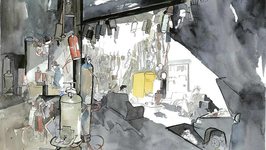
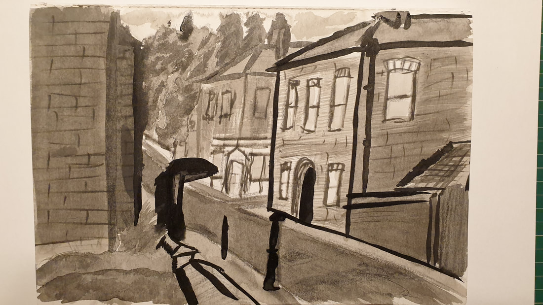
Research & InspirationPaul Hogarth - Brendan Behan's New YorkPaul Hogarth was a British illustrator, known for his reportage works, one such series was a set of illustrations made for a book, Brendan Behan's New York (1964), these illustrations are all ink sketches of various parts of New York. There's an interesting mix of detailed work and broader suggestive marks. Ronald Searle - Paris SketchbookRonald Searle was a British cartoonist known for his wartime reportage work, the St. Trinian's series, the Molesworth series, and political satire. However, amongst the prolific tides of works Searle produced in his career, he managed to fit in some urban sketches of Paris for a book in the 1950s. Similar to Hogarth's work, Searle's piece are ink drawings of the city but Searle's pieces seem more focused on the quality of line. Lizzy Stewart - Travel DiariesLizzy Stewart is a contemporary British illustrator known for her work on children's books. Whenever she travels, she brings along a sketchbook and adds to her series of Travel Diaries, there are a range of materials and styles at play in each set of images she creates for each location. I have selected a few pieces that are particularly interesting to me in the way they each convey their depictions of a scene. The use of colour will be something I explore in future works, however, at the moment I am more keen to examine the use of tonal values in these works. George Butler - WithDraw From AfghanistanGeorge Butler is a contemporary British reportage artist, known for his work regarding current affairs particularly focusing on conflicts in the middle east and the fallout surrounding those events. I've selected images from his series WithDraw From Afghanistan (2014) to showcase his approach to reportage artwork, principally the way he composes his works with the use of negative space and dramatically reduced detail to draw the viewer's eyes around each piece. Urban Sketching In CarlisleThe locations of choice for my urban sketching crawl of Carlisle are those on the route I would walk on the way into university. I've tried to achieve a more loose feeling to my drawings by sketching out only the most basic of information in pencil before jumping ahead into an inked illustration. Many of the artists' works I've looked at do not have clean and crisp lines in them, I feel like this adds more character to a drawing, whereas drawings with absolutely accurate lines feel a little soulless and clinical.  Fine Liner Sketch of St. James road
 Fine Liner Sketch of the view of Dixon's Chimney from Dalston road
Drawing with ink & brush allows a much quicker depiction of atmosphere and lighting in these pieces, diluting the ink to open up a range of grey tones helped me create a more moody feel to my work, even when they're produced quite quickly.  My Window View in Fine Liner
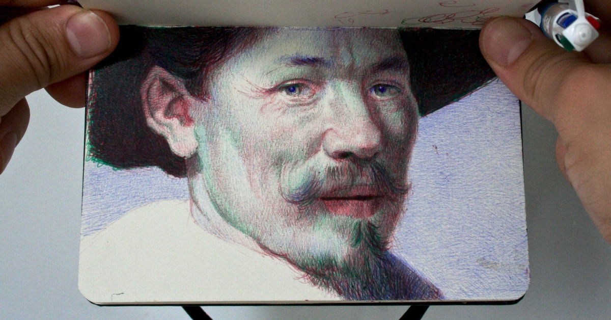
Artist's SketchbooksEverything an artist publishes is curated and is only the tip of the iceberg, sketchbooks are what's under the water.
Cats & DogsResearch & InspirationTroy Picou - Water Pony
An example of a more refined sculpture made from found parts shaped to purpose. Cardboard Sculpture Animals  A few companies make DIY cardboard sculpture/ puzzle pieces in the shape of animals. Just flat pieces of cardboard slotted together to make a three dimensional shape. Found Material Cats & DogsEgg Carton Cat This cat is made from a single egg carton cut to shape with some coloured card for eyes. Due to the scale of things, the head is exaggerated, almost like a tribal mask in its proportions. Kitchen Roll DogThis is a very simplistic and minimalist approach, even more so than the other sculptures. I believe it's the shape of the ears that sells this as a dog. This one is a kitchen roll tube, some egg carton for the ears, and a quartered wine cork skewered with toothpicks for the feet and legs. Drinks Can CatI'm sure with a swirling tail this piece could be a very convincing pig. The opening of a can makes a perfect mouth. This cat is a paper covered drinks can with a few pieces of roughly carved foamboard for feet. I added some lines to the paper to make it look slightly more like fur, and less like pig skin. MasksResearch & InspirationPacific Island MasksNative American Masks
Very simple holes and lines can give the impression of a face. Once a face has been established on a mask, greater abstraction can occur, in the form of exaggerated human features, or even the integration of animal characteristics. Found Material MasksDussack Beetle MaskFulfilling the definition of mask in the broadest sense, I present myself strapping two quite heavy leather covered swords to my head. With a limited time-frame (1 hour) for this particular mask I ran with the idea that two curved swords tied together look like a beetle's horns. They're quite intimidating, but incredibly awkward to wear.  This mask is incredibly basic and rough. As much cordage as I could find wrapped around to keep it together, and excess used as the strap to attach it to my head, balancing everything on my nose. Wearer comfort was clearly not a consideration in the creation of this mask.  Food Face MaskThis mask is inspired by high society hand-held masks that are often in abstract shapes, and do not obscure the entire face. However, I contrast this by constructing the mask out of nostalgic snack foods from my childhood, which I believe aren't quite as high-brow as opera masks. The body of this piece was a piece of card cut into an abstract head shape, then a cardboard nose & eyebrows were added with similarly abstract forms to them. For the blue shadows on this mask I used the salt packets present in Salt & Shake crisps. The hair is made from cuttings of the backing paper in Fruit Winders. And, finally, the eyes are made from the plastic collars on Lemonade bottle lids.  Passport Photo Vibes  Wine Glasses Have Nothing On A Mysterious Glass Jar Cardboard Helmet MaskThe inspiration for this mask should be quite obvious, a medieval helmet. I applied a light ink wash for some additional detail, since it would be just bare cardboard without it.  Instead of modelling the mask myself, I used an arming sword as a substitute. The curved guard hints at shoulders.  Since there was no face behind the mask, I was able to experiment with different lighting in my images, using the shadow as part of the piece.
The construction of this piece is very simple, just cut cardboard with a light ink wash on one side, taped to the handle of a sword.
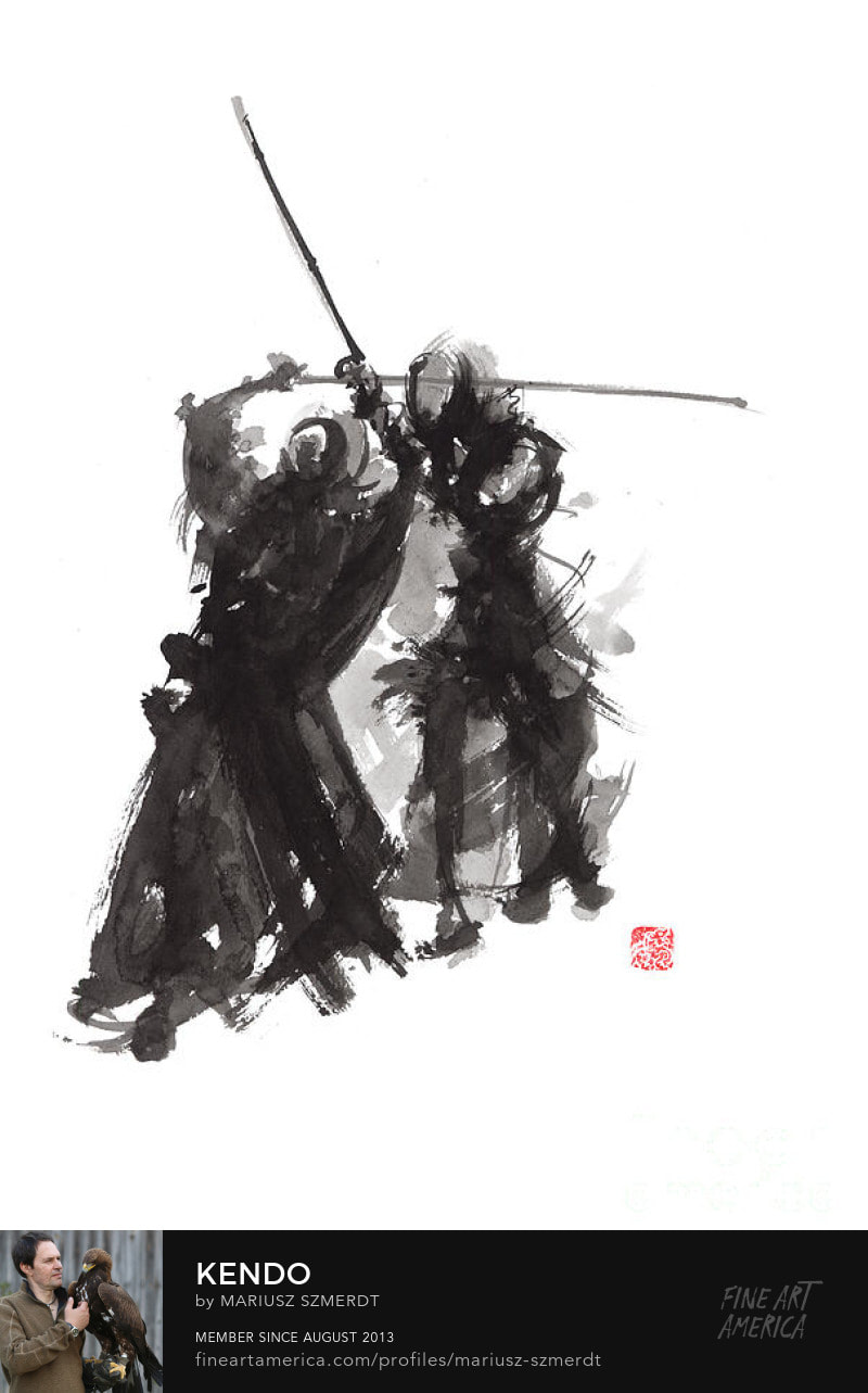
Research & InspirationRonald Searle - War Time DrawingsWhile Ronald Searle's war time drawings are not made with ink, they exhibit the use of improvised tools for mark making. These also demonstrate the effective use of line weight to describe form. Mariusz Szmerdt - Ink Wash Paintings
Diluting the ink to greater degrees conveys aerial perspective and a sense of scale within these illustrations.
 The use of diluted ink to create tones of grey alongside pure black strokes adds an additional dimension to the work. Describing movement with the lighter tones of ink help add to the dynamism within the piece without detracting from the primary focus, as those lines do not contrast as much as the black. Ink Mark MakingUsing coloured stock allows highlights to be added directly to a drawing with more contrast after the main bulk of ink is laid down.  Art Quote Typography, Brush & Ink
The accessibility of ink drawing is a huge boon to the medium. I believe some of my best works in this project are made with nothing more than ink and a broken coffee stirrer to apply it with, of course ink illustrations can be substantially more refined if an artist chooses to make them so.
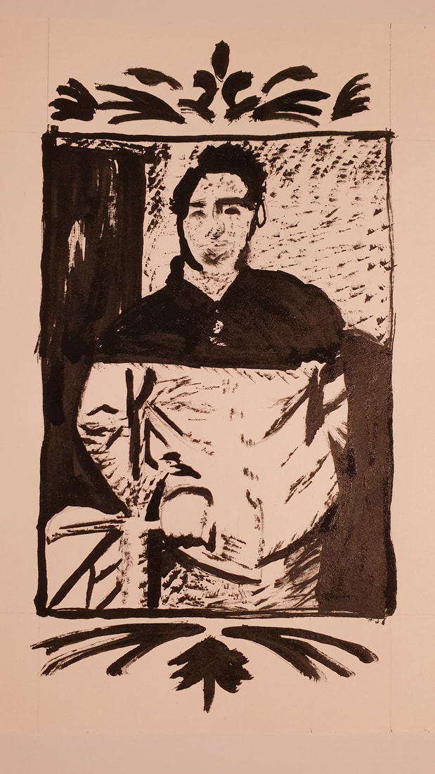
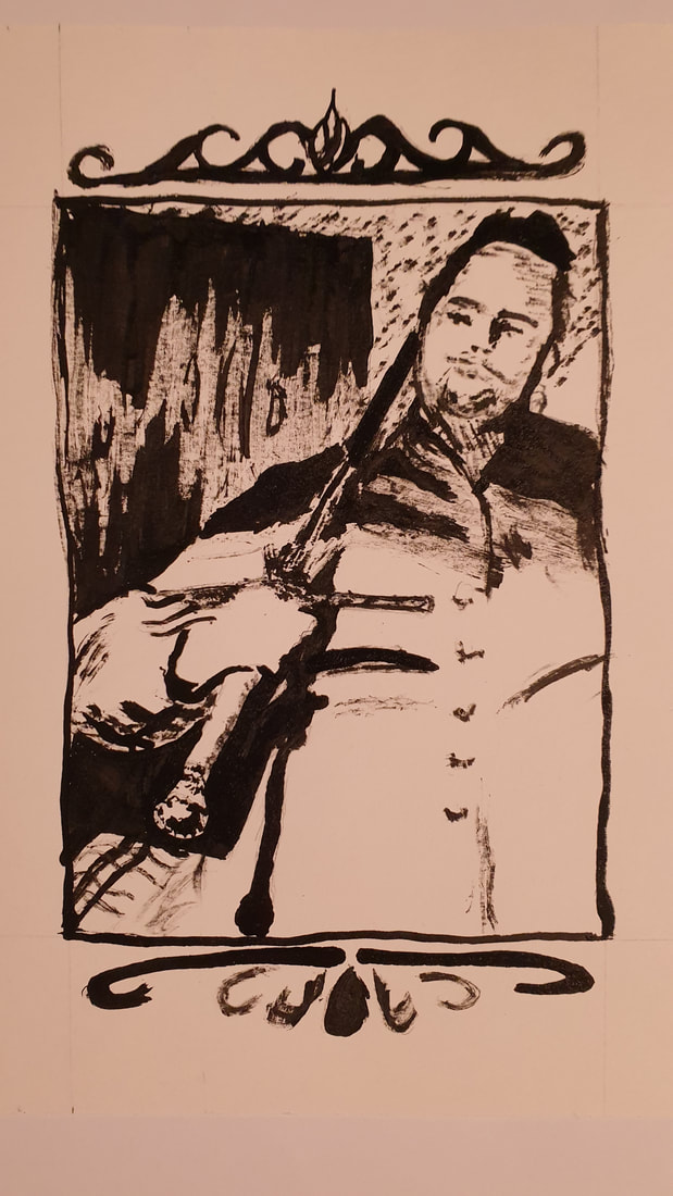
 Sword Portraits, Improvised Ink I find the rougher quality of ink based illustrations made with improvised tools and harsher brush work appealing, working with a singular tone encourages a greater reliance on negative space to convey details.  Sword Rest, Improvised Ink The binary nature of pure ink illustrations adds a greater atmosphere, with areas of harsh shadow and blazing light working together to describe a scene. Throughout the week or so of doing these ink drawings, I had one large drawing pasted up on a wall that I would work at when I could, the process for this drawing was informative, and I documented the end of a few key stages. This drawing is more accurate and considered because I knew I'd be working on it over several days, and so I planned it out to a greater extent than the more fast and loose illustrations previous. Spatial DrawingsThis task required an illustration of a room in our house. Given that I was living in student accommodation at the time, I had the choice between: my bedroom, my shower room, or the shared kitchen. I decided on my bedroom and began sketching out some ideas as thumbnails.
I explored different viewpoints around the room, to find a unique angle approach to this task from, I ultimately settled on a perspective that would be physically impossible to get, an isometric view of the room.  I've seen quite a few digital perspective drawings of rooms start off with just the floor plan, which is then manipulated digitally into a flat perspective plane on a canvas, and the perspective illustration is then built on that foundation. I decided that a rough floor plan would be a good way to get an idea of the space but that since this project was purely an analogue endeavour I could not use the digital method for my end result.  After I mapped out the floor plan with accurate-ish measurements, I then made a basic 3D model of the room in SketchUp. Using this 3D model and my floor plan, I was then able to translate my room into an isometric drawing. In some of my research into isometric illustrations, I found many of them were clean and crisp vector-based graphics. These were are very modern, but I felt that they had a soulless aspect to them. They all showed everything in a nice neat box with flat colour on every surface, maybe a gradient if you're lucky, no texture, no character.  Isometric Slice Of My Tiny Student Room For my final piece, I decided to crop the frame, and focus more on surface textures to add some life to the illustration. Cropping the frame was and attempt to highlight how small and cramped the room is, by forcing the view to a narrower aspect. I have almost entirely omitted shadows in this piece to focus on texture work without creating any conflicting areas of noise.
For this project we were tasked with summarising a film of our choice using 10 images posted in a social media context. As blogs are social media, this is it. I chose Dredd (2012), the criminally underrated film based on the 2000 AD comic series Judge Dredd. Dredd's setting is complex and unique, a dystopian future in which the earth has been ravaged by nuclear war and climate change humanity dwells in gigantic cities stretching the length of continents known as Mega Cities. Within Mega Cities, unemployment, boredom, and crime run rampant. The only people keeping order within mega cities are the dictatorial authoritarian police force known as Judges, judges have the responsibility to be judge, jury, and executioner regarding all crime within mega cities, carrying out on-the-spot judgements for any and all criminal infractions. (The following paragraph is most of the film premise in text, I'd advise skipping past it, and viewing the images first) Dredd (2012) focuses on a single day of Judge Dredd's career as a street judge, the day Judge Dredd is tasked with evaluating the viability of a special-case rookie judge Cassandra Anderson. Anderson is a mutant with psychic abilities, her psychic abilities are what allows her to progress to an evaluation despite failing the entrance exam. Dredd accompanies Anderson out on patrol, allowing her to call the shots as he evaluates her performance. Anderson decides they will respond to a triple homicide in the Mega Block Peachtrees, after investigating this particularly gruesome and public crime, the pair of judges track down and detain the prime suspect and intend to interrogate him back at the station. However, Peachtrees goes into a state of lockdown just before they exit, leaving them trapped inside. It is made apparent that the lockdown was no accident, Peachtrees is under control by a crime syndicate determined to kill both judges and stop them from interrogating their suspect. With no way out, and plenty of criminals out to get them, Dredd & Anderson must fight their way up through all two hundred floors to regain control of the mega block and deal with the crime syndicate. I feel like Dredd (2012), despite being dismissed as gratuitously violent and departing from its source material, manages to tell it's story through considered imagery interwoven with calculated minimalist dialogue, it's very pragmatic and efficient just like it's titular protagonist (I would argue Anderson is the primary protagonist however).
I've no doubt the subtlety and nuance of the film is somewhat lost in my interpretation despite my best efforts to broaden every definition in the brief to my advantage (37 panel comic as 10 images because the pages are one image each, technically). Despite that, I had fun with this project. I played around with watercolour, had a subject I was passionate about, and discovered why comic pages are rarely in landscape (the composition is hellish (maybe I'm just not practiced enough in comic composition yet)). The inclusion of quotes from the film to accompany my imagery helps carry the lack of dialogue, and text in general within my comic, by providing additional context that also links back to the source material. It really helps that almost all the dialogue in Dredd (2012) is memorable and impactful, so its capacity to assist alongside imagery is even greater. However including quotes directly from the film itself may give the impression that I expect the audience to have already seen the film (which you should if you haven't, just because it's a good film) but I believe the effectiveness of the quotes when accompanied with my images is not compromised if there's no prior knowledge of the film, the quotes themselves merely add additional context to my images and do not rely on prior knowledge. While my image making may be quite amateur in the watercolour medium, the experimentation was a worthwhile endeavour and a fun experience. Even with the challenge of landscape comic composition and unfamiliar medium, I feel like I've successfully managed to convey the gist of Dredd (2012) in my 10 images. Alongside a typographic project, we were tasked with creating an entire alphabet out of objects we could find. I just so happened to have my HEMA kit with me on the day, and so I decided to make my alphabet out of swords.  As I knew quite quickly what I was going to use for my alphabet, I had plenty of time to add additional elements to my alphabet in the form of punctuation. Alongside our other projects this term, we've been in various workshops experimenting and learning their capabilities.  Lino Prints, Monoprints & Printing Plate.  Etching Prints & Plate. In this project we were given the choice of six nursery rhymes, for which we would create a 12 page book containing the words of the chosen nursery rhyme and illustrations to tell the story. |
Author:Elliot Watson, Illustrator with a background in historical swordsmanship and all the weird and wonderful trappings that entails. Archives
November 2021
Categories |


























 RSS Feed