TheElliotWatson.GRILLUST.UK
  • Home
  • About
  • Blog
  • Contact
  • University Projects
    • Year 2 Project Links
    • Year 3 Project Links

A Totally Legitimate Art Blog

History & Practice: Hochschule Für Gestaltung (HfG) Biography - Dieter Rams

29/10/2019

0 Comments

 
The Hochschule Für Gestaltung (HfG). or Ulm school of design was founded in in the city of Ulm, Germany. HfG was created by Inge Aicher-Scholl, Olt Aicher, and Max Bill. It opened in 1953 and closed in 1968​.
The Ulm school of design mirrored the Bauhaus' approach to artistic creation: integrating art & design with advances in contemporary technology. However, HfG took this further than the Bauhaus, by exploring Art's relationship with contemporary thought and how the two interact and affect each other.
Dieter Rams was a designer who is known for his functional and simplistic designs in the world of consumer products, and furniture.
​Dieter Rams was born in 1932 in Wiebaden, Germany. Rams pursued architecture and interior design at Wiebaden's school of Art in 1947.
In 1953 Rams successfully completed his studies at Wiebaden's school of Art. Fresh from his studies, Rams was hired by Otto Apel, an architect in Frankfurt.
In 1955 Rams was hired by Braun, a consumer products company based in Kronberg.
Rams was promoted to chief officer of design at Braun in 1961, a job which he kept until 1995.
Picture
Dieter Rams Portrait, 2010 (Age 78)
Rams was involved in the HfG by way of a design collaboration effort with Braun and the HfG. This cooperation was engaged in with the hopes to create unique product designs to help Braun stand out in the market. Rams' role in this was spearheading the principles of design to create a consistent, recognisable Braun Style which all products made by the company should adhere to.
Dieter Rams' involvement with the HfG by way of a consumer product company affirms the HfG's founding principles of Art & Design integrating into contemporary technology and development of the modern way of life.
The products Rams would go on to make with the HfG would be everyday products available, and distributed to everyday households, thus influencing the zeitgeist on a grand scale.
The neutrality of Rams' designs, the muted colours, the organised forms, and simple shapes allow them to slot into the background of most interior spaces which enables people to impose their own décor style upon these designs should they wish, adding personality to the impersonal designs.
This clean integration adds a timeless quality to these designs, thereby having few interior environments where they would stand out negatively, which widens their potential appeal.
Sources
0 Comments

History & Practice: Bauhaus Biography - Josef Albers

28/10/2019

0 Comments

 
Josef Albers was born in Bottrop, Germany in 1888, was employed as a teacher from 1908 to 1913, then later moved to Berlin and specialised as an art teacher from 1913 to 1915, he then moved to Essen to work as a printmaker in 1916 until 1919. In 1919, Albers moved to Munich to study at the Academy of Fine Arts.

Albers began his study at the Bauhaus in 1920, studying under Johannes Itten in a foundation course.
In 1922 Albers was asked to join the Bauhaus' faculty, and become a master. Albers accepted and decided to focus on stained glass as his preferred medium. In 1923 Albers was asked by Walter Gropius (Founder, and current Master of the Bauhaus school) to teach the preliminary course regarding craftwork due to his relevant background in making.
Picture
Josef Albers Portrait, 1944 (Age 56)
In 1925, the Bauhaus moved from Weimar to Dessau and Albers became a professor. Albers' work turned towards furniture design and glassworks. Albers taught as the master of crafts.
As the Bauhaus closed in 1933 due to political tension, its students and faculty went their separate ways.
Albers emigrated to America and became a painting teacher at Black Mountain College, NC from 1933 until 1949.
Albers left Black Mountain College and joined Yale University's faculty as their head of design in 1950 until he retired from teaching in 1958.
In 1963 Albers released Interaction of Color, his book describing his perception on colour theory.
In 1973 Albers received membership to the American Academy of Arts and Sciences.
He died in 1976 in the city of New Haven, CT.
Sources
0 Comments

History & Practice: Comparing Constructivist Art & Design

16/10/2019

0 Comments

 
Constructivism is a minimalistic, geometric, dispassionate art style that arose in 1913's Russia, and gained popularity in 1917, after the Russian communist revolution.
In lieu of The Great War, ideals of a better tomorrow, and unity were the emergent paradigm, Constructivism builds on these themes with its orderly compositions, harmonic inclusions of photographic depictions of people, and its simple and consistent colour scheme.
Constructivism was used by the Russian socialist state as a form of propaganda, using art & design to educate the masses, to construct the ideas of tomorrow.
Picture
Dobrolet Airline Poster, 1923 - Alexander Rodchenko
This poster is promoting the nationalised Russian airline Dobrolet, as such, information regarding the airline is presented as typographic elements. As the text is primarily informative, its treatment is orderly and clear so that the viewer may read it easily.
The text upon the plane, Dobrolet, is part of the dynamic illustration which is the centrepiece of this poster. The angle at which the plane is tilted (Diagonally across) is a recurring compositional theme of many other Constructivist works.
Regarding the more rhetorical elements of this poster, the large bold exclamation mark draws attention to the poster, then the similarly coloured black border, which is an arrow that  leads the audience's eye to the airline's name, information regarding stock sales in the airline, a banking company and its derivative assets (my Russian translation may be a little rough), then finally To All To All To All. Which I interpret the meaning to be an airline owned by the people for the people. The arrow then terminates dynamically facing the centrepiece illustration.
Picture
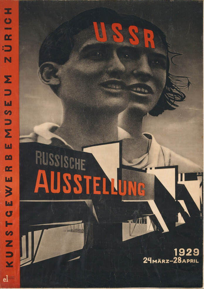
Zurich Russian Exhibition Poster, 1929 - El Lissitzky
This poster is advertising a Russian exhibition in Zurich, giving information about the venue, and the date of the exhibition. The typographic elements present in the image are arranged so that they align with the image's perspective.
The lines created by shadows in the image orient themselves on the diagonal, following with constructivist convention.
Unlike the previous poster, photography is featured as the medium for the primary image.
The use of photography can be used to depict propaganda pieces as a captured reality, an accurate representation of reality captured in a photograph. However, the use of photography in this particular poster is more abstract, the combination of two heads so that they share an eye, unifying their vision which follows the rhetoric of the USSR. The combination of both a male and female head may also allude to the state of equality all people are under in the communist regime.
Constructivist works have a very limited colour palette, usually black, red, and the paper's colour (Pale white or yellow). This limited palette may have been a design decision, but another factor may be that constructivist artworks are state-manufactured propaganda and, as such, the mass-produced nature of the product requires the cheapest materials, hence Red and Black pigments which were historically cheap to produce. However, these colours contrast well with each other, and appear very bold when overlapping.
Red may represent the blood, passion, and work that has gone into the initial revolution and subsequent duties of the citizens of the USSR.
​Black is a very absolute, authoritative colour which may represent the strength and resolve of the communist regime, it also draws the eye quite quickly which would be an advantage for propaganda posters.

The use of photography in constructivist works may enhance the futuristic rhetoric of the political ideals by using more modern image-making technology. Photography is also a quicker, more immediate way of creating images which would be preferable for the production of up to date propaganda. Photographic images may be viewed as a more reliable, sincere depiction of people than paintings as a photograph's content cannot be influenced by an artists biases.
Sources
0 Comments

History & Practice: End of the 19th Century - Differences Within Art Nouveau Across Europe

13/10/2019

0 Comments

 
Art Nouveau is a decorative art style that developed around the 1890s as a rebellious counter-culture, rejecting the established academic arts' convention towards art and design. Art Nouveau was the new-hotness hitting the European art stage with flowing curves, unified design aesthetics, and dynamic forms inspired by nature. Art Nouveau ("New Art" in French) spread from France and  developed unique aspects as different European countries' culture influenced their art and design.

Glasgow - Scotland

Glasgow's style of art nouveau was more geometrically focused, with limited, less extreme usage of grand whiplash curves. The more organised, and practically structured nature of this style works well when applied to architectural design.
Picture
Martyr's School Doorway, 1895 - Charles Rennie Mackintosh
The unique style of art nouveau in Glasgow was developed by a quartet known as "The Glasgow Four". This group comprised of
  • Charles Rennie Mackintosh 1868 - 1928
  • Margret MacDonald Mackintosh 1864 - 1933
  • Herbert MacNair 1868 - 1955
  • Frances MacDonald 1873 - 1921
Picture
Queen's Cross Church Window Drawing, 1896 - Charles Rennie Mackintosh
The Glasgow style of art nouveau seems to have developed alongside the constraints of architecture, as such the designs are limited within relatively standard forms present on buildings. There are no impractically decorative elements included in the Glaswegian style of art nouveau, yet the decorations that are present have the nature-inspired flowing design that is common in traditional art nouveau.
Picture
Glasgow Herald Building Drawing, 1894 - Charles Rennie Mackintosh
Picture
Glasgow Herald Building Doorway Painting , 1895 - Charles Rennie Mackintosh
Picture
Revolving Bookshelf, 1904 - Charles Rennie Mackintosh
As the Glasgow style of art nouveau developed, it became more geometrically focused. This revolving bookshelf has no natural-looking curves, it is entirely geometric in its aesthetic. This trajectory of development would lean into the Arts & Crafts movement.

Madrid - Spain

Madrid's, similar to Glasgow's, Art Nouveau style is intertwined with the city's architecture. Madrid experienced an urban expa​nsion near the end of the 19th century, resulting in the construction of many new buildings as the city grew. 
Picture
Palace of Longoria Exterior Tower, 1902 - José Grases Riera
Picture
Palace of Longoria Interior Stairway, 1902 - José Grases Riera
Madrid's Modernista style of Art Nouveau  developed in the early 20th century as new  decorative buildings were commissioned.
Picture
Palace of Longoria Railings, 1902 - José Grases Riera
Madrid's integration into national trade was primarily focused on the construction industry, aiding in its localised expansion of architecture.
International trade of construction materials would allow new buildings to explore and utilise a wider array of materials with less financial risk.
Picture
Palace of Longoria Balcony Railings, 1902 - José Grases Riera
Picture
Palace of Longoria Interior Stairway Railings, 1902 - José Grases Riera
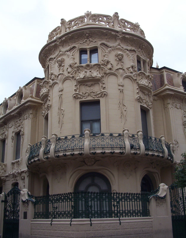
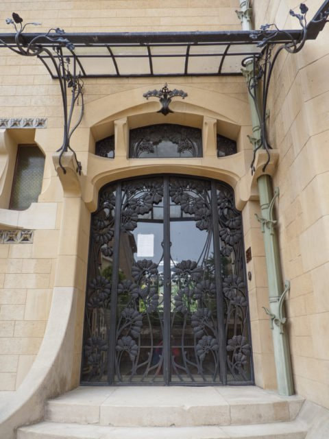
Madrid's Art Nouveau style is considerably more nature-centric when compared to the geometric themes of Glasgow's style. Floral features and organic curves are present in almost all aspects of Madrid's style, depicted in plaster, iron, and glass decorations.

Nancy - France

Nancy is considered the epicentre of the Art Nouveau movement as it spread across Europe. As such, Nancy has a greater number of Art Nouveau buildings than any of the other Cities we've looked at.
The style of Art Nouveau present in Nancy is focused on nature, features of plants, and insects are common in the decorative elements of Nancy's Art Nouveau architecture.
Picture
Génin-Louis Lintel, 1901 - Henri Gutton, Henry Gutton, & Frédéric Schertzer
Picture
Shop Vaxelaire, 1901 - Charles Andre, Emile Andre, & Eugene Vallin
Picture
Villa Majorelle Doorway, 1902 -Henri Sauvage
Picture
Huot House Doorway, 1903 - Émile André
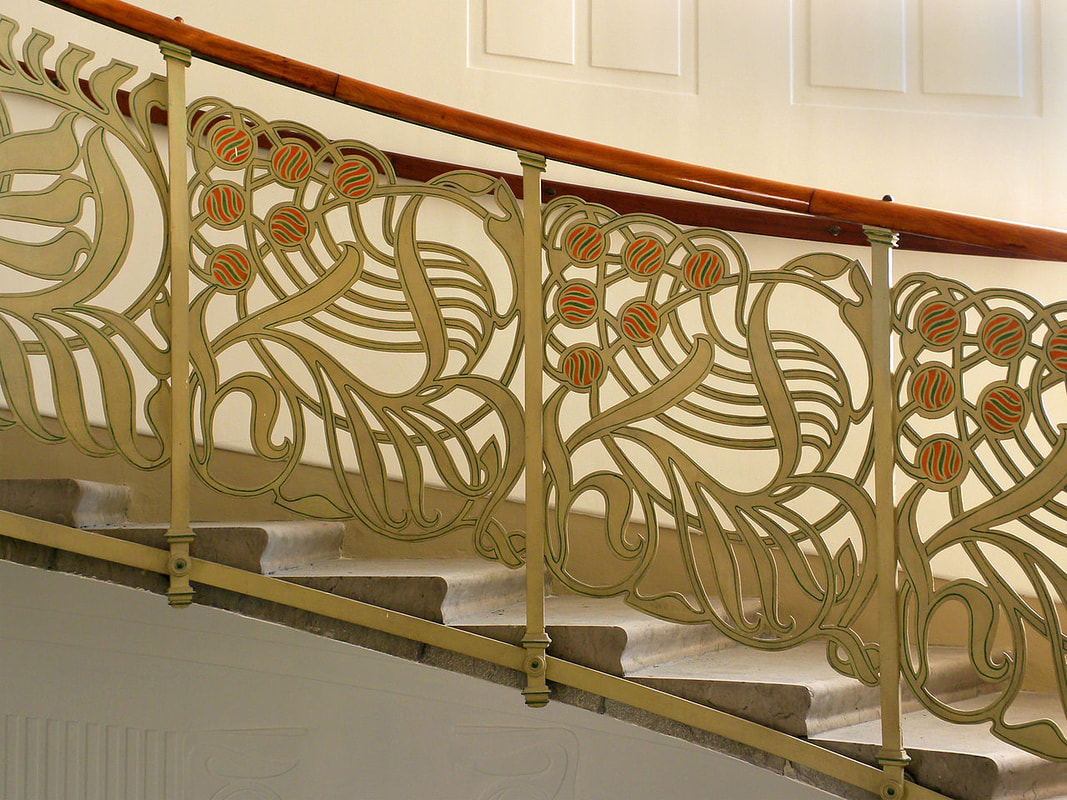
Nancy's Art Nouveau style combines several materials made more accessible due to growing industry within the region into decorative architecture.
Iron and wood works provide a façade for panes of glass, clear or decorated. These fronts silhouette plant-like structures from the inside of a building, while also containing a more detailed face that projects outward.

Vienna - Austria

Vienna's Art Nouveau movement goes by the name Jugendstil which translates as "Young Style", or "Youth Style". This style of Art Nouveau originated in Germany and spread throughout the south-eastern parts of Europe. This style shares a similar focus on natural forms and more organic, flowing lines.
As with the other cities covered, Vienna was experiencing a period of growth, resulting in new infrastructure and more buildings being constructed with modern materials. A new railway system was being built in Vienna during its Jugendstil period, as such stations and grand public halls were being constructed to accommodate the railway.
Picture
The decorative elements in Vienna's style seem to have a more practical and restricted form, similar to the Glasgow style, they do not impede the functionality of an object. Vienna's Art Nouveau decorations seem to be applied to an object rather than being integrated into the object unlike the styles of Madrid or Nancy where the decorative element is integral to an object's structure, where form and function are one-in-the-same.
Picture
Picture
Picture
Picture
There is a clear disconnect between decorative elements and practical elements of Viennese Art Nouveau constructs. However, the decorative elements seem to be more lavish in their aesthetic, golden elements feature prominently leaving some of the less shiny assets in the design go unnoticed.
Sources
0 Comments

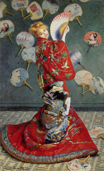
History & Practice: Japanese Art's Influence on European Art and Design in the late 19th Century

6/10/2019

0 Comments

 
Japan spent over 220 years with closed borders and limited trade policies enacted in the 17th century. This policy was established off the back of the sengoku jidai, "age of civil war", resulting in a unified Japan after 148 years of military conflicts.
Japan's self-imposed isolationist policy towards global affairs was forcibly ended by America via two warships in 1853, resulting in Japan trading with America (at cannon-point). This trade opened up Japanese goods and culture to the western world.

Claude Monet - Case Study

Claude Monet:
  • Born in Paris, France - 1840
  • French Painter
  • Founding Impressionist
  • Died in Giverny, France - 1926
Picture
Madame Monet in a Japanese Kimono, 1875 - Claude Monet
In this example of Japan's influence on Art, the content heavily features Japanese items, the Kimono, and the rather excessive number of uchiwa upon the wall and floor. However the style of the piece retains a more traditionally western technique and aesthetic.
Picture
Madame Monet and her Son, 1875 - Claude Monet
In contrast to Monet's shocking Japanese fan collection, this painting is western in its form and content, featuring Monet's Impressionist style depicting contemporary French fashion in a French setting.

Vincent Van Gogh - Case Study

Vincent Van Gogh:
  • Born in Groot-Zundert, Netherlands - 1853
  • Dutch Painter
  • Post-Impressionist
  • Died Auvers-sur-Oise, France  - 1890
Picture
Courtesan, 1887 - Vincent Van Gogh
This is a pretty hard gotcha for Van Gogh, as this painting features a very Japanese figure with the same pose as an original Japanese print (see right).
However, Van Gogh has changed several elements from the original, transforming it in the process. The inclusion of a painted background is a great departure from the original, as well as several changes in details of the figure.
Picture
Beauty and Sumida River, ~1810 - 1820 - Keisai Eisen
The original print Van Gogh is drawing from, like many Japanese prints appears on a minimal canvas, leaving the figure to float in space free from unnecessary detail.
Picture
Self Portrait, 1887 - Vincent Van Gogh
In contrast to Van Gogh's swamp-integrated Courtesan, this self portrait features the use of a western painting technique, Pointillism, far from the clear and clean lines of Japanese prints.
​Pointillism developed in France focusing on colour-theory, contrasting colours, and many smaller marks constructing the painting as a whole.
Japanese woodblock prints tend to feature a relatively limited colour palette, especially when compared to the plethora of hues present in a pointillist painting.
Colours present on woodblock prints are very flat, whereas pointillist colours convey a range of textures and depth.
Sources
0 Comments

    Author:

    Elliot Watson, Illustrator with a background in historical swordsmanship and all the weird and wonderful trappings that entails.

    Archives

    November 2021
    October 2021
    September 2021
    May 2021
    April 2021
    March 2021
    February 2021
    December 2020
    November 2020
    October 2020
    April 2020
    March 2020
    January 2020
    December 2019
    November 2019
    October 2019
    September 2019

    Categories

    All

    RSS Feed

Site powered by Weebly. Managed by 34SP.com
  • Home
  • About
  • Blog
  • Contact
  • University Projects
    • Year 2 Project Links
    • Year 3 Project Links