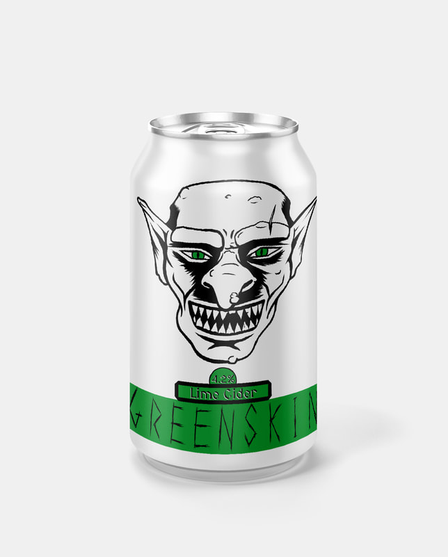
BriefCreate a series of themed beverage can designs with a consistent visual style. Another one-week project prioritising speed of outcomes rather than depth of research & development stages. The theme of my label designs is fantasy races, with the drinks being named after commonly used derogatory terms for each race. The style I decided to go with is a minimalist line-art & inking illustration. This is contrasted by the use of a single bold colour to serve as a banner for the drink's name to sit on. The banner colour is also present in the eyes of each character illustration to add some flare to the black & white illustrations. The names of all the drinks are hand-drawn type, rendered in a manner that represents the character illustration, to link the two separate elements using semiotic aspects of fantasy pop-culture.
The decision to use a mostly white can was to contrast well within the context of a store shelf filled with many different highly decorated designs full of colour.
0 Comments
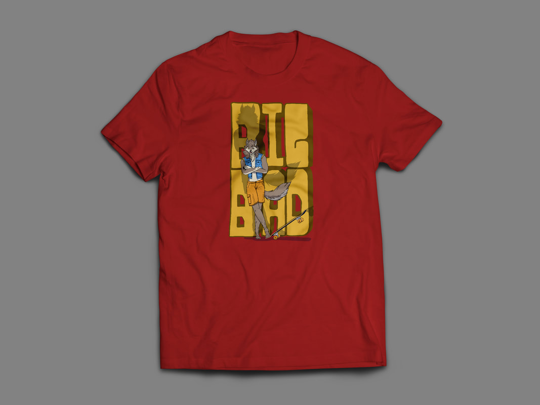
BriefCreate a series of T-shirt designs with a consistent style & theme, one week project focused on speed of outcomes. The theme of my series will be folklore tales mixed with skating. I decided to illustrate the characters from Red Riding Hood, but in the midst of skating action, with more modern clothing choices. The illustrations will be accompanied by typography in a graffiti/ street-art style. DesignsThe contrast in line-weight and overall stylistic direction between the typography and the character illustrations creates disharmony within the images. Standing alone; the characters all have a consistent aesthetic, as does the typography. Yet, when they are married together the differences in style is too great. I believe this is due to the relative time spent on each element, the typography was intentionally very quickly done, without correcting many mistakes in its creation, whereas the character illustrations were slower, more methodical, & precise in their execution. T-Shirt MockupsEach design is tested on a variety of shirt colours to evaluate the change in clarity of design. Brief
To use photography to create a series of illustrations with a consistent visual style/ artistic voice.
The aim of this project is to create artwork quickly, instead of spending days on outcomes we are to spend hours/ minutes so that multiple pieces may be completed within a single day. There are no parameters for this project, so we are free to create whatever we want. This project is to last one week. Research & Inspiration
Since I haven't done any portrait illustrations outside of line art sketches, I searched for tutorials for the medium I would be working in: digital art.
This tutorial covers realistic portraits, which take many hours, if not days to complete, I will have to abridge this process so that I will be able to create my pieces at a faster rate.
Speed in art comes from:
As we are free to create our portraits on any subject, I have decided that mine will have a theme. My series of portraits will be digital paintings of Steven Seagal as he progresses through his career: from young (30s) Steven Segal in the 1990s (The Under Siege era), to the fat, but still producing action movies, (60s) Steven Segal in the 2010s (The Goatee-era).
Currently, Steven Seagal is a target of ridicule as he has fallen from grace quite rapidly as his career progressed, which is why I've got no problem doing a series of (probably unflattering) images on him.
Outcomes |
Author:Elliot Watson, Illustrator with a background in historical swordsmanship and all the weird and wonderful trappings that entails. Archives
November 2021
Categories |


 RSS Feed