|
The lockdown diary should fit these criteria:
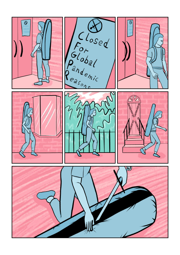
The story I will be telling in my comic is the cancellation of sword fighting activities due to lockdown, transitioning into doing sword drills in a cramped indoor space, and then the resulting destruction and renovation of the indoor space.
Thumbnails
These are the rough compositional thumbnails in roughly the format I want to produce this book in.

As I'm going to make this comic digitally, I looked at some tutorials on techniques that other artists use to produce their comics.
A complete view of a comic development process from conception to finished product has given me a good idea on how to proceed with my own work-flow.
The use and adaptation of three dimensional assets can be used to speed up aspects of drawing, and keeping subjects consistently proportioned, but for the moment this technique feels more advanced than I am capable of within this project.
Page Sketches
These are the sketches made digitally in the exact format I will produce the comic in. I will ink all the sketches, adding details and refining the composition, and then colour the resulting linework.

Back (Left) & Front (Right) Cover Sketches
Illustrated Pages
0 Comments
Composition PrinciplesThe way an image is constructed within a frame changes how it is perceived. Humans have many in-built pre-conceptions about shapes, lines, colours, and their interactions relative to each other, for example straight parallel lines orientated in increments of 90° reinforce the idea of structure and stability, whereas lines that are almost 90° begin to create a sense of instability and tension. The way pieces of art are composed within a frame can reliably exploit these pre-conceptions to change the mood of the work.
Thumbnail Compositions Thumbnails With Dynamic Composition, Washing Clothes, & Skiing To explore composition, and thumbnail visuals, we were given six scenarios to create a series of thumbnails for, and then create a more developed thumbnail visual for the intended outcome piece.
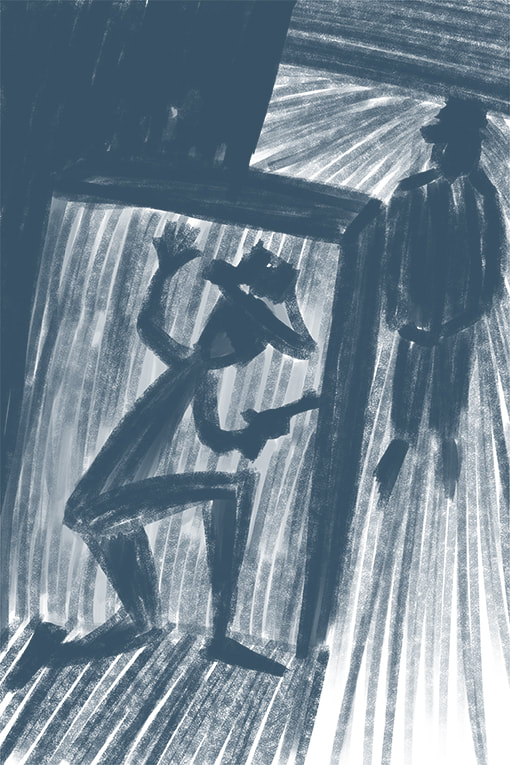
Ambushed Thumbnails
Vertigo Thumbnails
Tango Thumbnails
Systems Failure Thumbnails
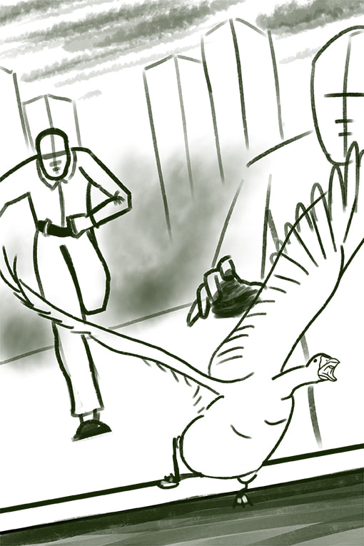
A Giant Leap
January Sales Thumbnails
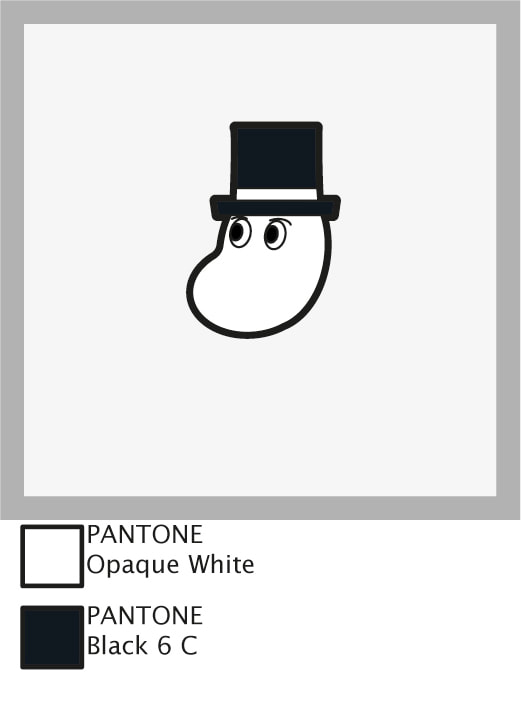
Within this project we're set to create three enamel badges, based on an already existing pop-culture property, with associated packaging & branding ephemera. These designs are to be limited to a maximum of four pantone colours & line, and to be an appropriate size for enamel pins (I've researched they should be 15-40mm²). Enamel Pin ExamplesThe conventional packaging for enamel pins is a piece of sturdy backing card to which the pin is attached, and often incorporated into the design so that the pin and the card compliment each other in their aesthetics. The degree to which the pin design and the backing card's design match can vary.
Subject Research - Moomins The modern 3D animated Moomn TV series, Moominvalley (2019), continues the soft & squishy look of its predecessors but with a new animation style. The 3D rendering uses lighting and gradients to describe the soft nature of the world its set in. While this style isn't something I'll be able to achieve with flat-colour enamel pin designs, the vibe is certainly something to aim towards.
The animated Moomin TV series in the 90s, Moomin (1990), has a very soft aesthetic to it, using pastel colours in a fantastical setting, the greater use of flat areas of colour allows a more direct translation from this iteration to enamel pins. I can see how certain solutions have already presented themselves in the way they are drawn & animated for some problems I might have in my designs.
The absurd contrast between the soft and gentle design of moomins and the presence of knives in the setting is very amusing. Very chaotic vibes.  The pastel colour pallet of pinks and purples adds to the mystical nature of the setting. It's definitely a combination I want to explore with my packaging treatment. Putting weapons in the hands of soft and round children's characters is a tradition that Moominvalley (2019) upholds.  The monochromatic design of the packaging is reminiscent of the original books & comic series of Moomins. Enamel Pin DesignsThe design restrictions are:
 Design Size Specifications Visualised
Quick Pin Mock Up Using Design Assets From Illustrator Imported To Photoshop  Backing Card Design I've tried to keep within the aesthetic of pink/ purple pastel colours for my backing card design. Leaving a central area to display the pin, and having a fairly balanced composition that draws the eye to the center of the frame. Now that I've got a template piece to work from, I have the option to alter the gradients slightly from piece-to-piece to hint at a handmade aspect to these backing cards.   
Having these mock ups scaled to their designed size of A6 helps judge the areas in which they succeed or fail much easier. It's very easy to get hung-up on tiny little details when working on a digital image that can scale dynamically, but taking a step back to look at the work as it's intended to be seen is important.
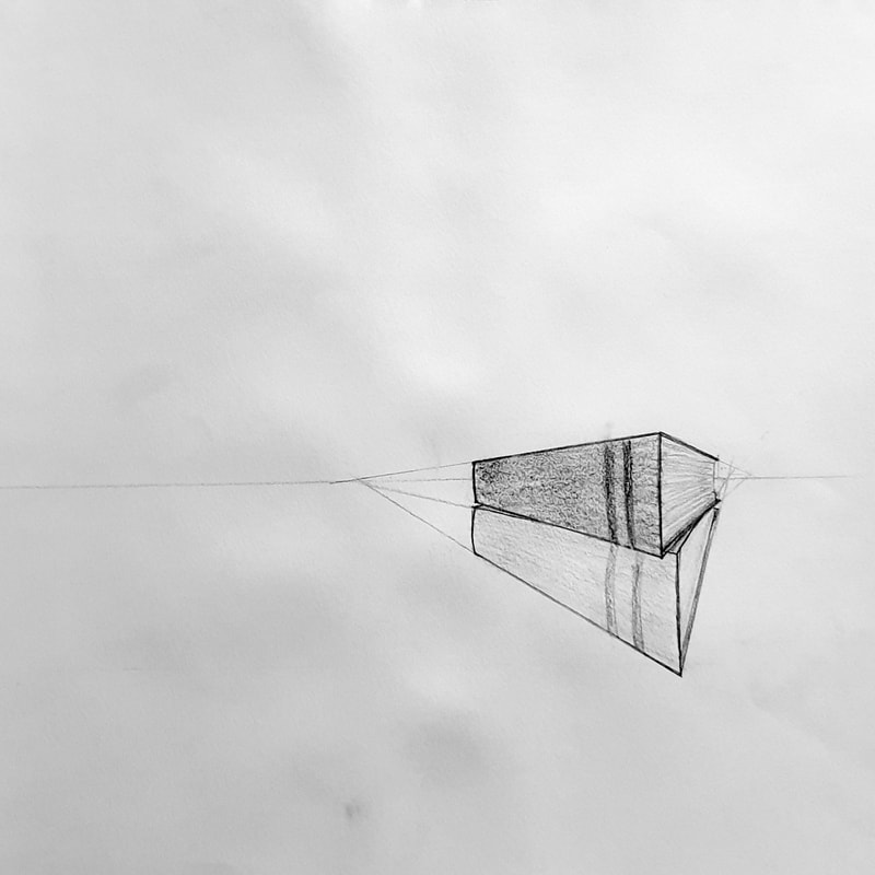
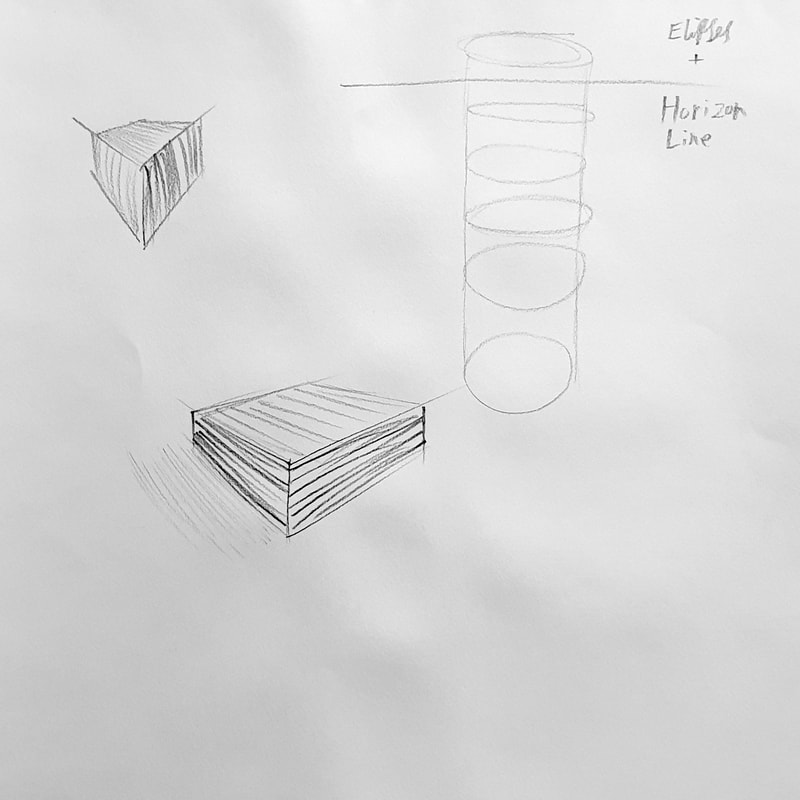
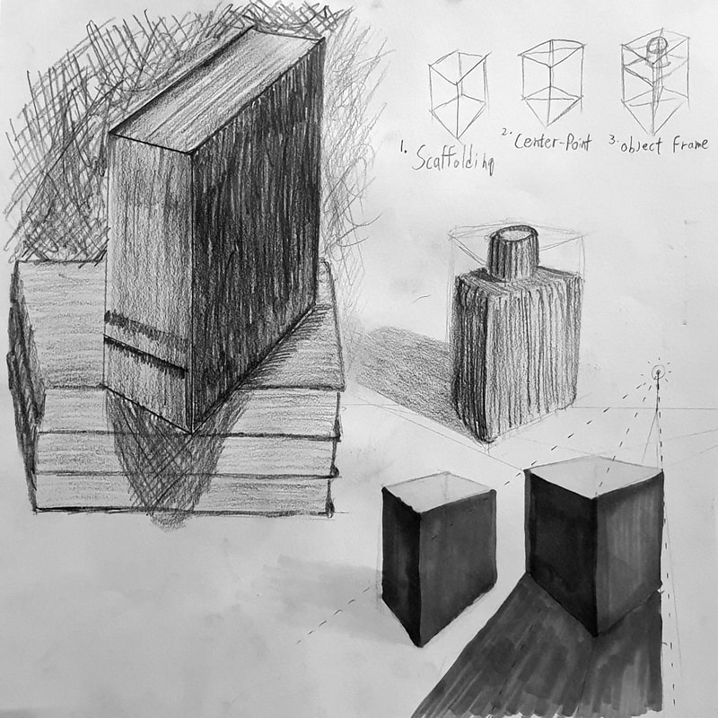
PerspectiveThese sketches explore the understanding of perspective, using a diagrammatic approach to break down the technique. Light sources and cast shadow are considered in some of these drawings as well as the impact of directional mark making to describe form.  In this exercise I looked at tonality in the form of an ink wash. Directional marks are more subtle in ink washes, but they still add to the sense of form and structure within the piece.
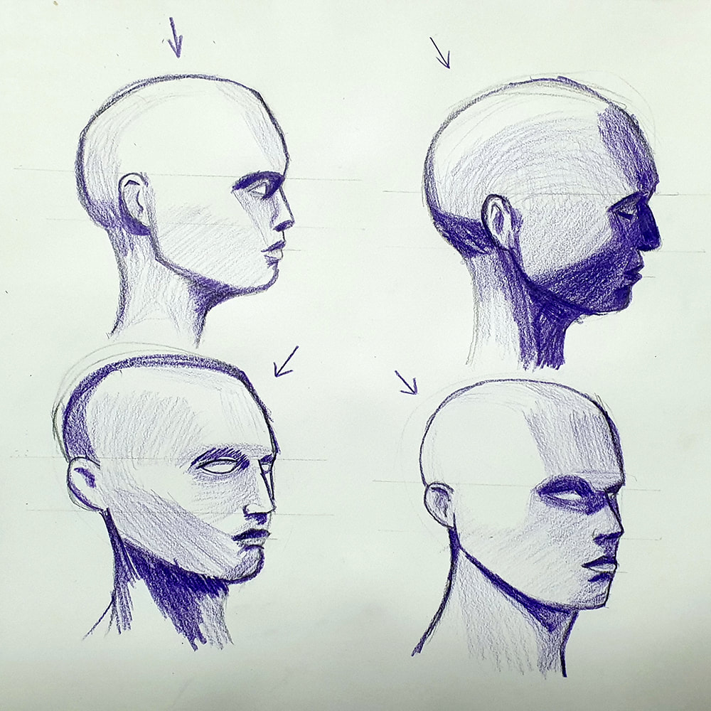
FigureHeadsGetting the head and its proportions right can make or break an illustration.    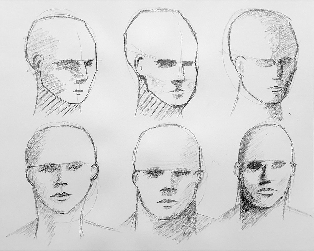 There's a slow progression through these six heads in using a wider range of tones, As I go through them I become more aware that I'm using mostly mid-tone greys and I try to use darker tones. In the examples where I have used darker tone I feel there's more weight to the illustrations.
I feel like using coloured pencils encourage me to explore a greater range of tones, instead of hovering around the mid-tone greys as I'm like-to-do with standard graphite pencils. Using the full range of tonal variations is something I've tried to be consistently aware of throughout this process. Blending areas of tone would make this head feel less geometric, the hard edges on the areas of tone make it look like it's chiselled from stone rather than made of flesh. The geometric look does however help define where the areas of tone sit on the face, it just needs smoothing out in the final rendering process.  |
Author:Elliot Watson, Illustrator with a background in historical swordsmanship and all the weird and wonderful trappings that entails. Archives
November 2021
Categories |


 RSS Feed