|
This project was split into two halves, in the first we were tasked with exploring colour and composition, creating compositions with restrictions and mixing paint to create colours. In the second half we were to create three distinct book covers for a book titled "The Tree", the genre of these book covers were to be Horror, Sci-Fi, and a Children's Book. These covers were to be done using the same approach as three artists, Anne Yvonne Gilbert, Charles Keeping, and Brad Holland.
0 Comments
For this project I was tasked with taking a piece of artwork from selected artists, and then trying to create a copy. This exercise encouraged me to research artists and materials, then reverse-engineer artistic techniques to create the effect I was looking for. This project was fun, as it was simply working with materials to create a known result. Good practice. For this project, every person in our art studio was tasked to create a single page featuring a few words from a song that was jumbled up by running it through google translate several times. All of these pages were compiled into a single book that was then sold at the Lakes Comic Art Festival. I've grouped some of the more visual and interesting parts of my development work and my final page. Fashion magazines may include a set of thematically-linked images spread across several pages to convey a rhetoric. Telling a story through fashion photography requires a conscious art-direction and multiple composed photographs so that all elements add to the narrative. The following fashion story is from the 1985 October edition of British Vogue magazine.
To create a unique challenge for myself, I decided to create a 3D construction using laser-cut parts. In creating the design for this piece, I had to carefully measure the depth of my material so that the 2D cut-out would allow the depth of material to fit through. The pieces fit well together, creating two stands and two rondel daggers. I could strengthen some of the joints with glue, but it is not necessary for them to stay together. Additionally, some of the edges could be cleaned up with some sandpaper, as they are quite rough right-off the laser cutter. Due to the limitations of the size of MDF sheets (Roughly A4) I had to work with, the design size is scaled down so that it fit my material size. This makes these pieces a good size to put on a desk or shelf for decoration without getting in the way too much, but it also means the Rondel handles do not fit larger hands.
 Just What Is It That Makes Today's Homes So Different, So Appealing, 1956 - Richard Hamilton

The Hochschule Für Gestaltung (HfG). or Ulm school of design was founded in in the city of Ulm, Germany. HfG was created by Inge Aicher-Scholl, Olt Aicher, and Max Bill. It opened in 1953 and closed in 1968. The Ulm school of design mirrored the Bauhaus' approach to artistic creation: integrating art & design with advances in contemporary technology. However, HfG took this further than the Bauhaus, by exploring Art's relationship with contemporary thought and how the two interact and affect each other.
Rams was involved in the HfG by way of a design collaboration effort with Braun and the HfG. This cooperation was engaged in with the hopes to create unique product designs to help Braun stand out in the market. Rams' role in this was spearheading the principles of design to create a consistent, recognisable Braun Style which all products made by the company should adhere to.
In 1925, the Bauhaus moved from Weimar to Dessau and Albers became a professor. Albers' work turned towards furniture design and glassworks. Albers taught as the master of crafts. As the Bauhaus closed in 1933 due to political tension, its students and faculty went their separate ways.
Constructivism is a minimalistic, geometric, dispassionate art style that arose in 1913's Russia, and gained popularity in 1917, after the Russian communist revolution. In lieu of The Great War, ideals of a better tomorrow, and unity were the emergent paradigm, Constructivism builds on these themes with its orderly compositions, harmonic inclusions of photographic depictions of people, and its simple and consistent colour scheme. Constructivism was used by the Russian socialist state as a form of propaganda, using art & design to educate the masses, to construct the ideas of tomorrow.  Dobrolet Airline Poster, 1923 - Alexander Rodchenko
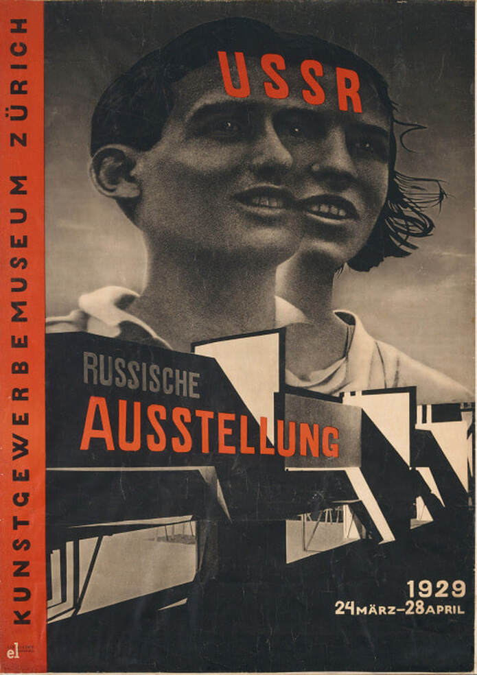 Zurich Russian Exhibition Poster, 1929 - El Lissitzky
Constructivist works have a very limited colour palette, usually black, red, and the paper's colour (Pale white or yellow). This limited palette may have been a design decision, but another factor may be that constructivist artworks are state-manufactured propaganda and, as such, the mass-produced nature of the product requires the cheapest materials, hence Red and Black pigments which were historically cheap to produce. However, these colours contrast well with each other, and appear very bold when overlapping.
Red may represent the blood, passion, and work that has gone into the initial revolution and subsequent duties of the citizens of the USSR. Black is a very absolute, authoritative colour which may represent the strength and resolve of the communist regime, it also draws the eye quite quickly which would be an advantage for propaganda posters. The use of photography in constructivist works may enhance the futuristic rhetoric of the political ideals by using more modern image-making technology. Photography is also a quicker, more immediate way of creating images which would be preferable for the production of up to date propaganda. Photographic images may be viewed as a more reliable, sincere depiction of people than paintings as a photograph's content cannot be influenced by an artists biases. |
Author:Elliot Watson, Illustrator with a background in historical swordsmanship and all the weird and wonderful trappings that entails. Archives
November 2021
Categories |


 RSS Feed