TheElliotWatson.GRILLUST.UK
  • Home
  • About
  • Blog
  • Contact
  • University Projects
    • Year 2 Project Links
    • Year 3 Project Links

A Totally Legitimate Art Blog

History & Practice: Comparing Constructivist Art & Design

16/10/2019

0 Comments

 
Constructivism is a minimalistic, geometric, dispassionate art style that arose in 1913's Russia, and gained popularity in 1917, after the Russian communist revolution.
In lieu of The Great War, ideals of a better tomorrow, and unity were the emergent paradigm, Constructivism builds on these themes with its orderly compositions, harmonic inclusions of photographic depictions of people, and its simple and consistent colour scheme.
Constructivism was used by the Russian socialist state as a form of propaganda, using art & design to educate the masses, to construct the ideas of tomorrow.
Picture
Dobrolet Airline Poster, 1923 - Alexander Rodchenko
This poster is promoting the nationalised Russian airline Dobrolet, as such, information regarding the airline is presented as typographic elements. As the text is primarily informative, its treatment is orderly and clear so that the viewer may read it easily.
The text upon the plane, Dobrolet, is part of the dynamic illustration which is the centrepiece of this poster. The angle at which the plane is tilted (Diagonally across) is a recurring compositional theme of many other Constructivist works.
Regarding the more rhetorical elements of this poster, the large bold exclamation mark draws attention to the poster, then the similarly coloured black border, which is an arrow that  leads the audience's eye to the airline's name, information regarding stock sales in the airline, a banking company and its derivative assets (my Russian translation may be a little rough), then finally To All To All To All. Which I interpret the meaning to be an airline owned by the people for the people. The arrow then terminates dynamically facing the centrepiece illustration.
Picture
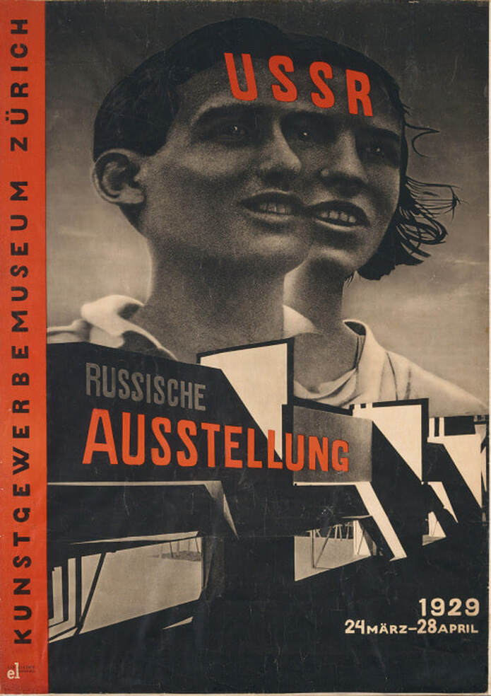
Zurich Russian Exhibition Poster, 1929 - El Lissitzky
This poster is advertising a Russian exhibition in Zurich, giving information about the venue, and the date of the exhibition. The typographic elements present in the image are arranged so that they align with the image's perspective.
The lines created by shadows in the image orient themselves on the diagonal, following with constructivist convention.
Unlike the previous poster, photography is featured as the medium for the primary image.
The use of photography can be used to depict propaganda pieces as a captured reality, an accurate representation of reality captured in a photograph. However, the use of photography in this particular poster is more abstract, the combination of two heads so that they share an eye, unifying their vision which follows the rhetoric of the USSR. The combination of both a male and female head may also allude to the state of equality all people are under in the communist regime.
Constructivist works have a very limited colour palette, usually black, red, and the paper's colour (Pale white or yellow). This limited palette may have been a design decision, but another factor may be that constructivist artworks are state-manufactured propaganda and, as such, the mass-produced nature of the product requires the cheapest materials, hence Red and Black pigments which were historically cheap to produce. However, these colours contrast well with each other, and appear very bold when overlapping.
Red may represent the blood, passion, and work that has gone into the initial revolution and subsequent duties of the citizens of the USSR.
​Black is a very absolute, authoritative colour which may represent the strength and resolve of the communist regime, it also draws the eye quite quickly which would be an advantage for propaganda posters.

The use of photography in constructivist works may enhance the futuristic rhetoric of the political ideals by using more modern image-making technology. Photography is also a quicker, more immediate way of creating images which would be preferable for the production of up to date propaganda. Photographic images may be viewed as a more reliable, sincere depiction of people than paintings as a photograph's content cannot be influenced by an artists biases.
Sources
0 Comments


Leave a Reply.

    Author:

    Elliot Watson, Illustrator with a background in historical swordsmanship and all the weird and wonderful trappings that entails.

    Archives

    November 2021
    October 2021
    September 2021
    May 2021
    April 2021
    March 2021
    February 2021
    December 2020
    November 2020
    October 2020
    April 2020
    March 2020
    January 2020
    December 2019
    November 2019
    October 2019
    September 2019

    Categories

    All

    RSS Feed

Site powered by Weebly. Managed by 34SP.com
  • Home
  • About
  • Blog
  • Contact
  • University Projects
    • Year 2 Project Links
    • Year 3 Project Links