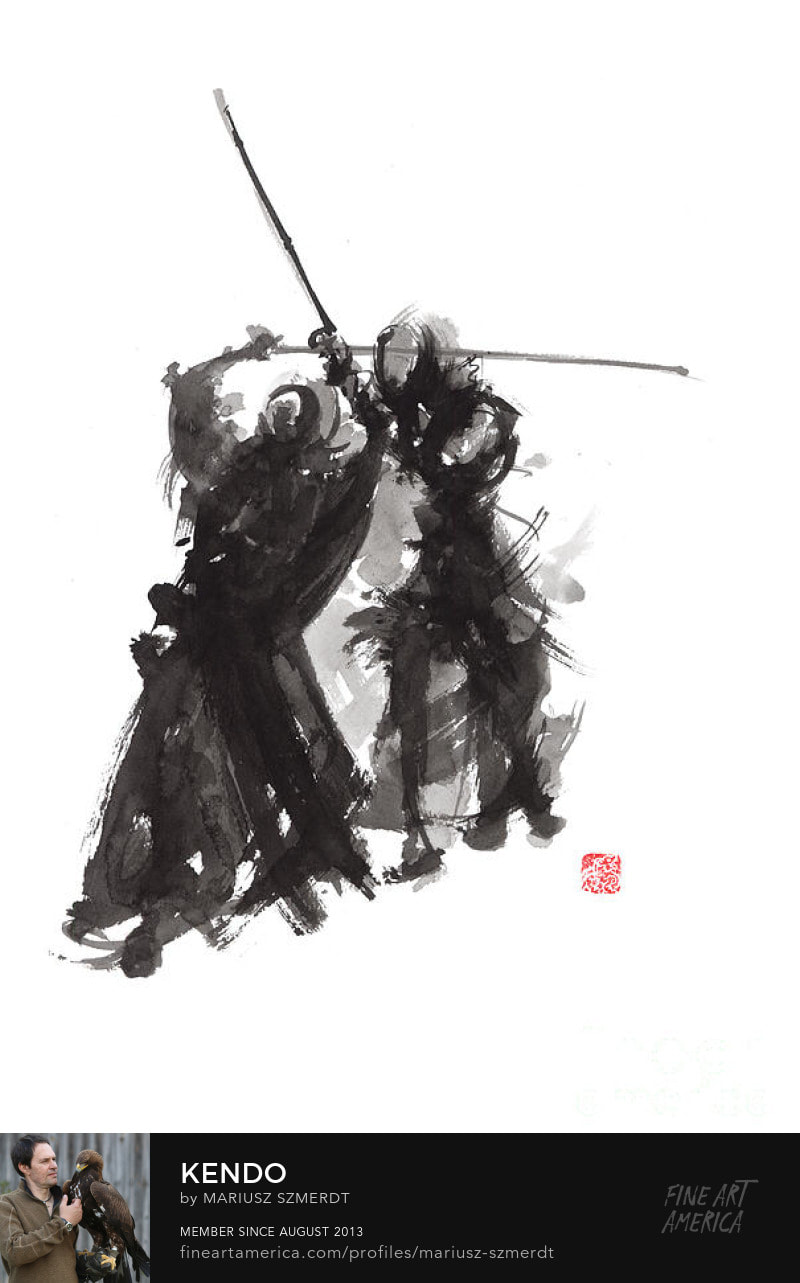
Research & InspirationRonald Searle - War Time DrawingsWhile Ronald Searle's war time drawings are not made with ink, they exhibit the use of improvised tools for mark making. These also demonstrate the effective use of line weight to describe form. Mariusz Szmerdt - Ink Wash Paintings
Diluting the ink to greater degrees conveys aerial perspective and a sense of scale within these illustrations.
 The use of diluted ink to create tones of grey alongside pure black strokes adds an additional dimension to the work. Describing movement with the lighter tones of ink help add to the dynamism within the piece without detracting from the primary focus, as those lines do not contrast as much as the black. Ink Mark MakingUsing coloured stock allows highlights to be added directly to a drawing with more contrast after the main bulk of ink is laid down.  Art Quote Typography, Brush & Ink
The accessibility of ink drawing is a huge boon to the medium. I believe some of my best works in this project are made with nothing more than ink and a broken coffee stirrer to apply it with, of course ink illustrations can be substantially more refined if an artist chooses to make them so.
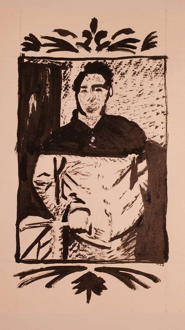
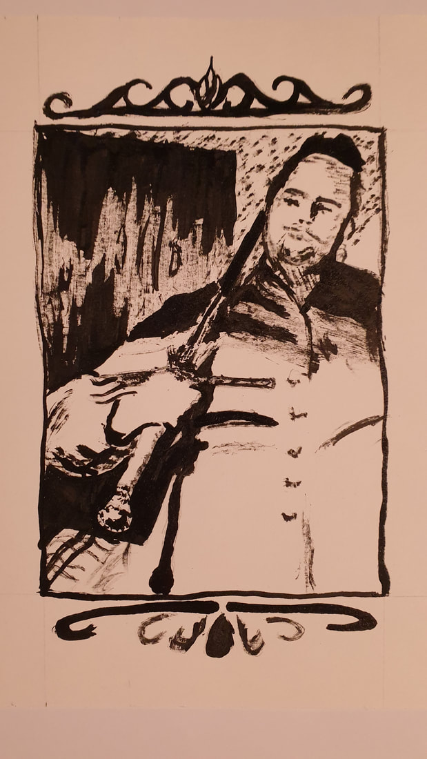
 Sword Portraits, Improvised Ink I find the rougher quality of ink based illustrations made with improvised tools and harsher brush work appealing, working with a singular tone encourages a greater reliance on negative space to convey details.  Sword Rest, Improvised Ink The binary nature of pure ink illustrations adds a greater atmosphere, with areas of harsh shadow and blazing light working together to describe a scene. Throughout the week or so of doing these ink drawings, I had one large drawing pasted up on a wall that I would work at when I could, the process for this drawing was informative, and I documented the end of a few key stages. This drawing is more accurate and considered because I knew I'd be working on it over several days, and so I planned it out to a greater extent than the more fast and loose illustrations previous. Spatial DrawingsThis task required an illustration of a room in our house. Given that I was living in student accommodation at the time, I had the choice between: my bedroom, my shower room, or the shared kitchen. I decided on my bedroom and began sketching out some ideas as thumbnails.
I explored different viewpoints around the room, to find a unique angle approach to this task from, I ultimately settled on a perspective that would be physically impossible to get, an isometric view of the room.  I've seen quite a few digital perspective drawings of rooms start off with just the floor plan, which is then manipulated digitally into a flat perspective plane on a canvas, and the perspective illustration is then built on that foundation. I decided that a rough floor plan would be a good way to get an idea of the space but that since this project was purely an analogue endeavour I could not use the digital method for my end result.  After I mapped out the floor plan with accurate-ish measurements, I then made a basic 3D model of the room in SketchUp. Using this 3D model and my floor plan, I was then able to translate my room into an isometric drawing. In some of my research into isometric illustrations, I found many of them were clean and crisp vector-based graphics. These were are very modern, but I felt that they had a soulless aspect to them. They all showed everything in a nice neat box with flat colour on every surface, maybe a gradient if you're lucky, no texture, no character.  Isometric Slice Of My Tiny Student Room For my final piece, I decided to crop the frame, and focus more on surface textures to add some life to the illustration. Cropping the frame was and attempt to highlight how small and cramped the room is, by forcing the view to a narrower aspect. I have almost entirely omitted shadows in this piece to focus on texture work without creating any conflicting areas of noise.
0 Comments
Leave a Reply. |
Author:Elliot Watson, Illustrator with a background in historical swordsmanship and all the weird and wonderful trappings that entails. Archives
November 2021
Categories |


 RSS Feed