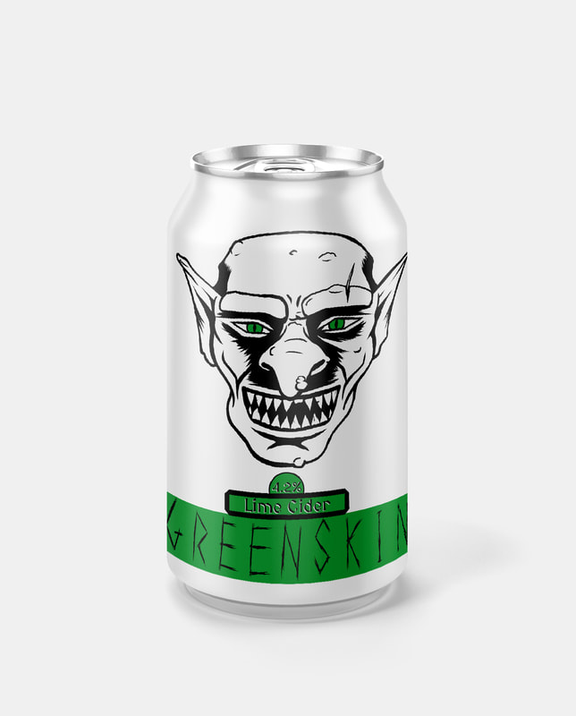
BriefCreate a series of themed beverage can designs with a consistent visual style. Another one-week project prioritising speed of outcomes rather than depth of research & development stages. The theme of my label designs is fantasy races, with the drinks being named after commonly used derogatory terms for each race. The style I decided to go with is a minimalist line-art & inking illustration. This is contrasted by the use of a single bold colour to serve as a banner for the drink's name to sit on. The banner colour is also present in the eyes of each character illustration to add some flare to the black & white illustrations. The names of all the drinks are hand-drawn type, rendered in a manner that represents the character illustration, to link the two separate elements using semiotic aspects of fantasy pop-culture.
The decision to use a mostly white can was to contrast well within the context of a store shelf filled with many different highly decorated designs full of colour.
0 Comments
Leave a Reply. |
Author:Elliot Watson, Illustrator with a background in historical swordsmanship and all the weird and wonderful trappings that entails. Archives
November 2021
Categories |


 RSS Feed